ARTIFACTS
1. Brand Identity
2. Night Market
Visual Identity, Experience Design
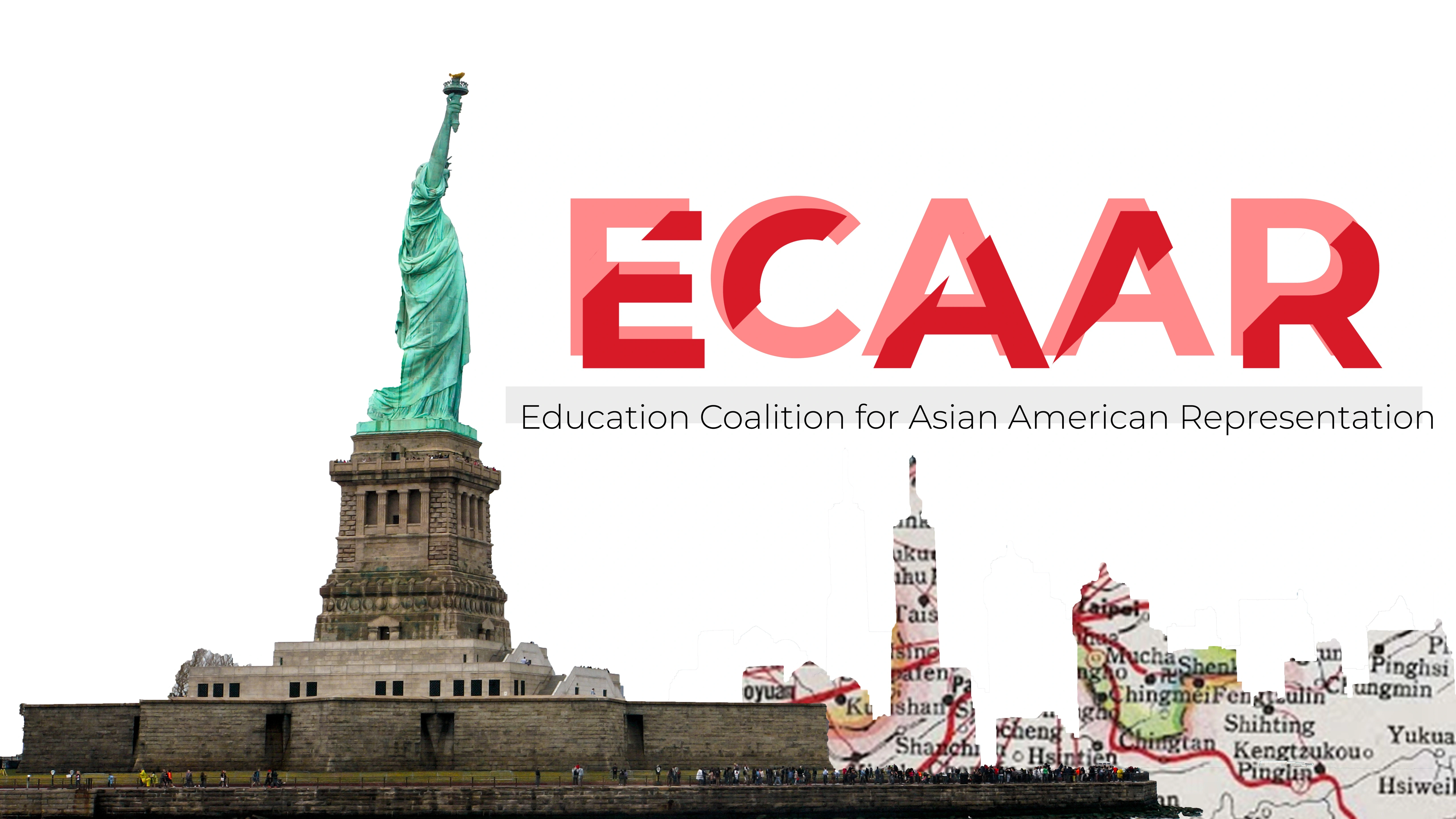
ECAAR Brand Identity
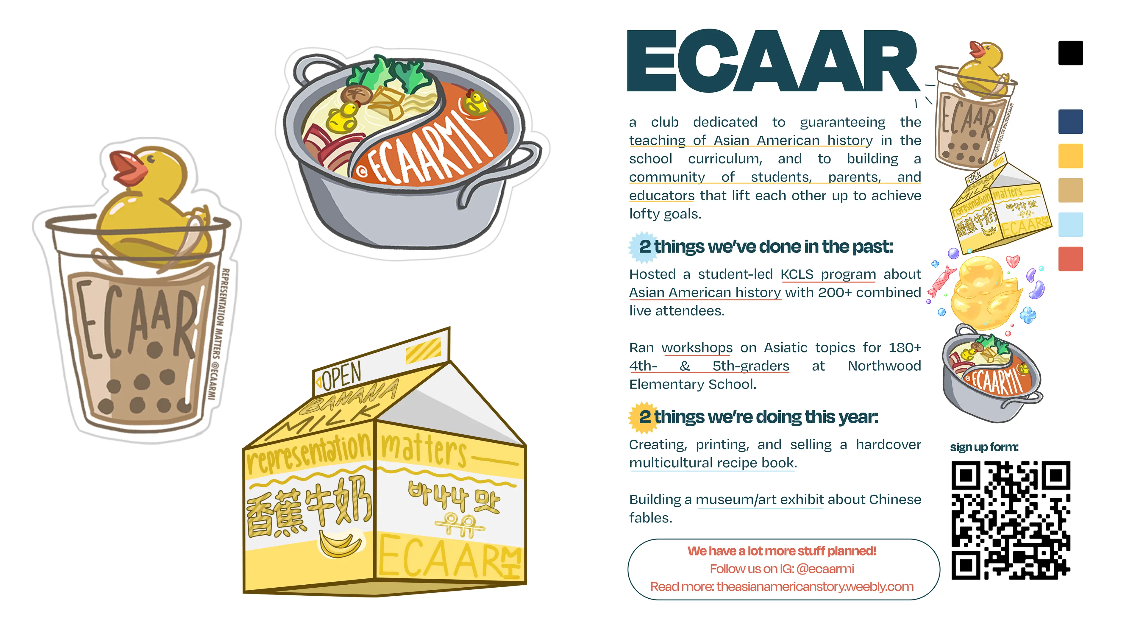
The Education Coalition for Asian American Representation (ECAAR) is an award-winning student-run organization that tells Asian American stories and fights for their inclusion in the American school curriculum. In the past, ECAAR has presented webinars, run workshops, proposed lesson plans, compiled resources, hosted a night market, sold a cookbook, and more.
TIMELINE-
June 2020 - June 2023
ROLE-
Design Lead, Co-President
DESIGN TEAM-
Garrett Lee, Lee Hardisty, May Tran, Priya Bhananker
OVERVIEW
This page includes ECAAR's original brand identity, the ECAAR Night Market, and the ECAAR Cookbook.
1. Brand Identity
A meaningful logo to promote credibility and memorability
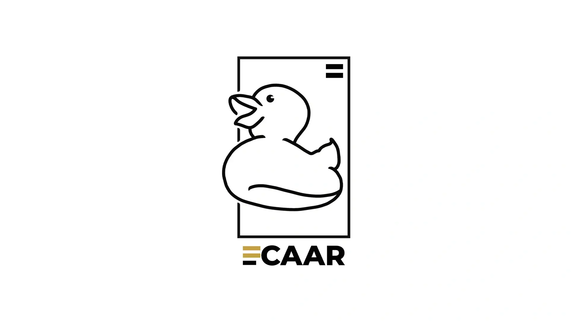
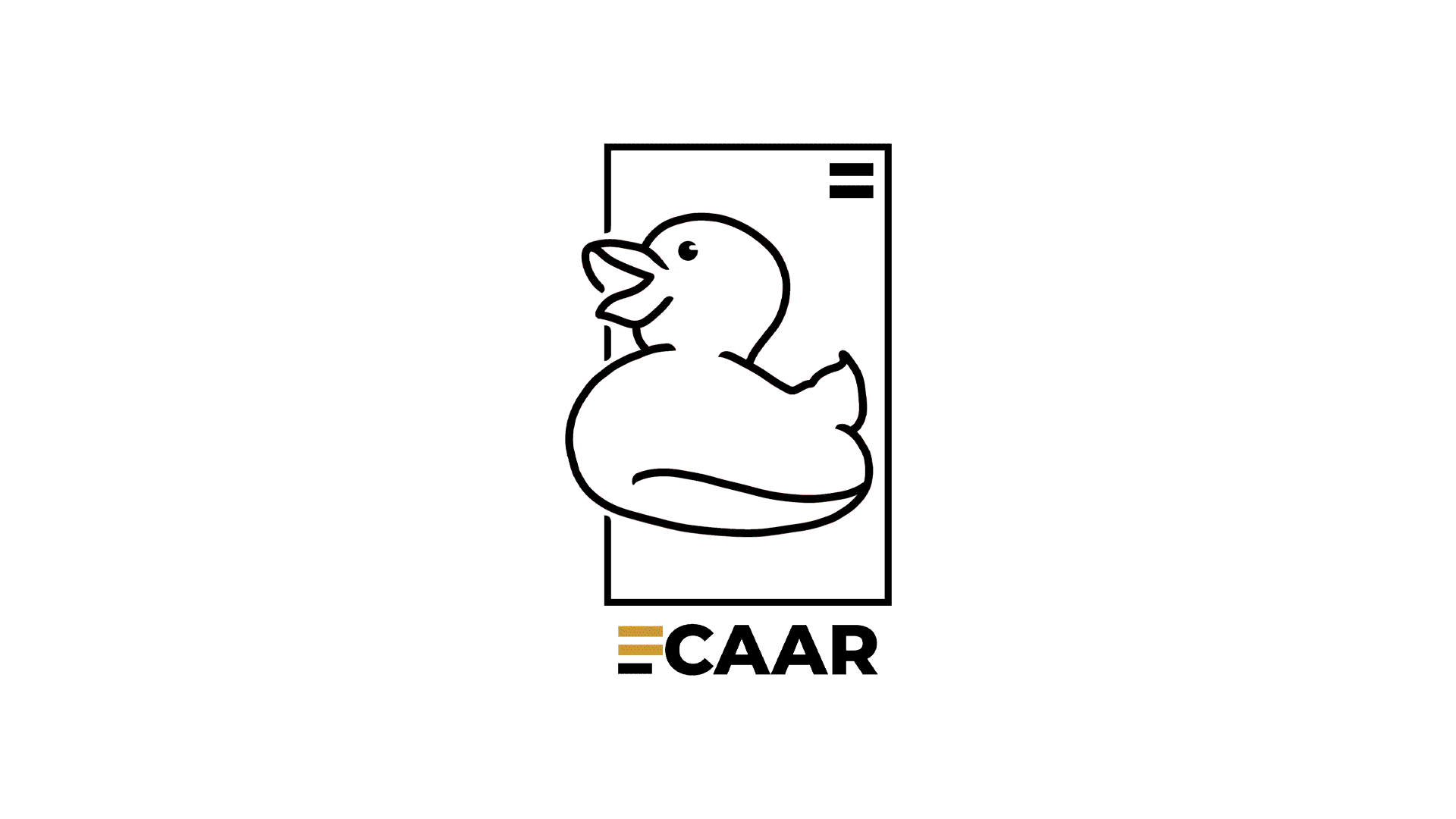
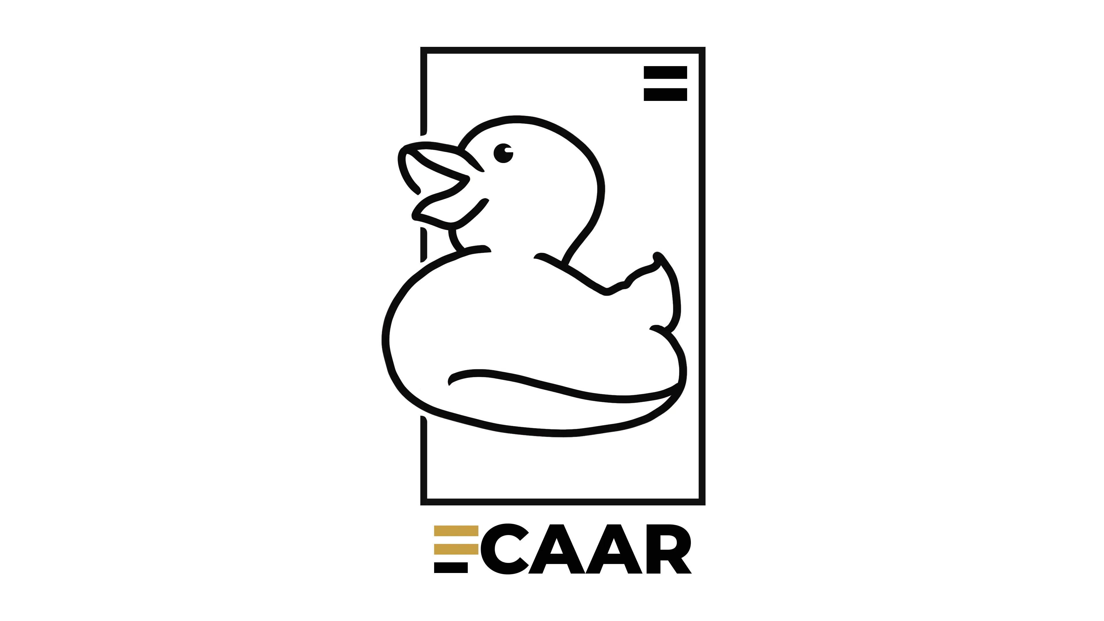
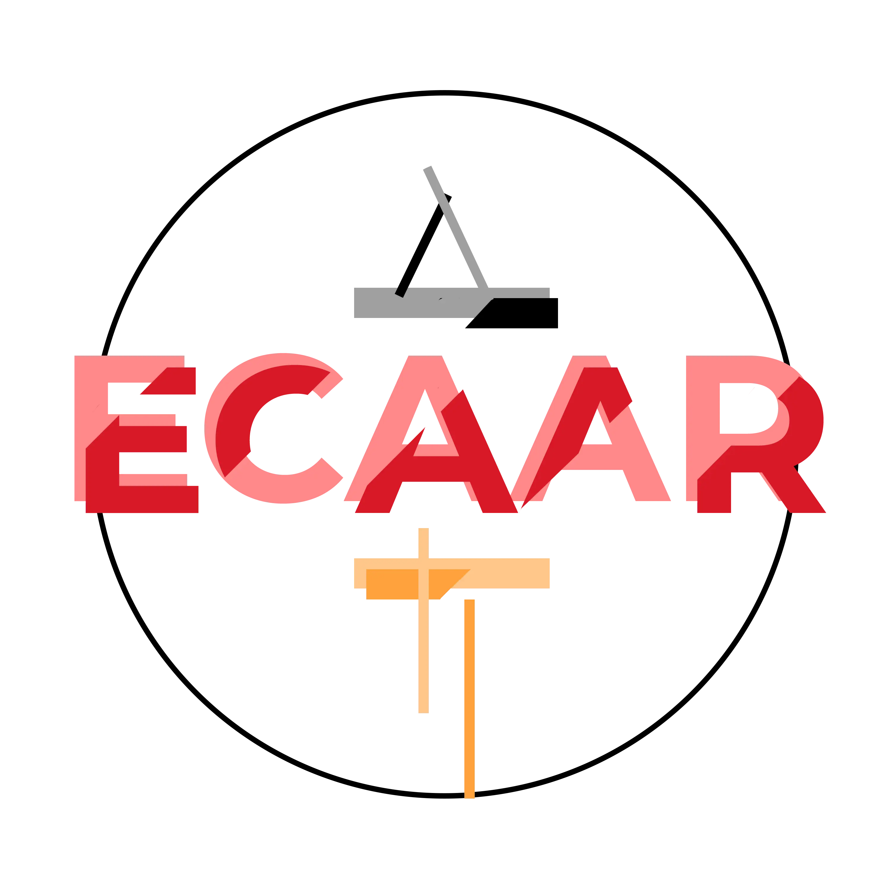
LOGO
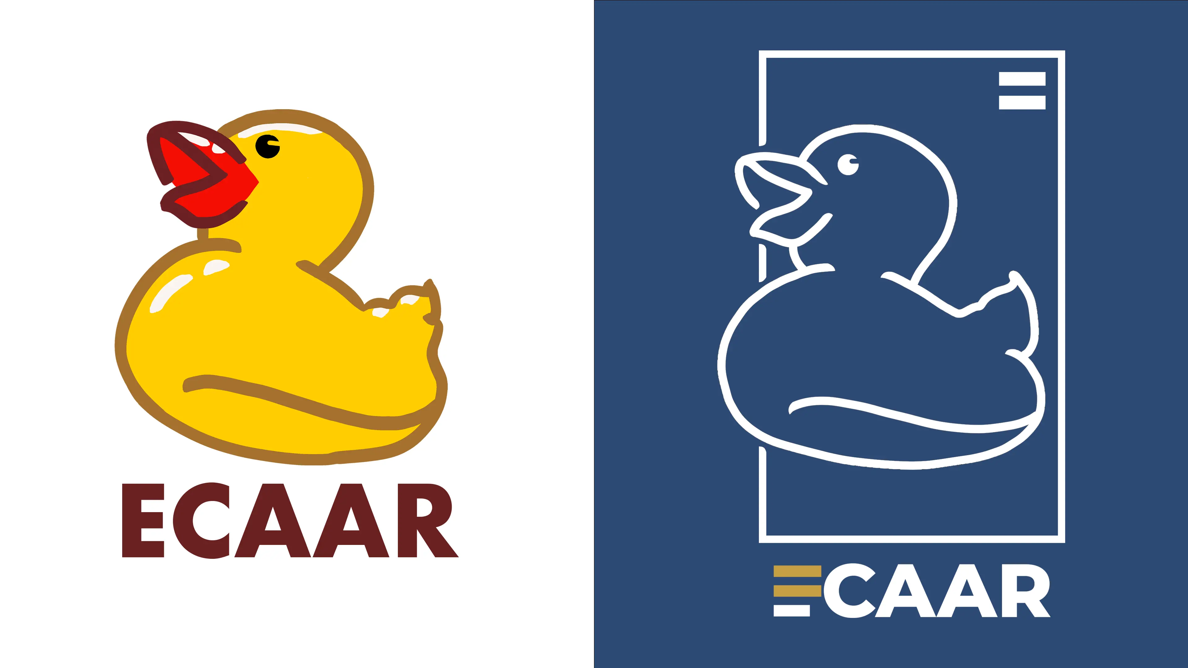
ECAAR’s branding utilizes the rubber duck, a Southeast-Asian symbol of freedom from autocracy, and the color yellow, referencing Yellow Peril. The design targets people of all backgrounds and ages. Colors are high contrast for visibility, and typefaces are sans-serif. ECAAR is student-run, so everything feels playful while still credible.
LOGO TYPES-
Primary, Wordmark, Icon-Based
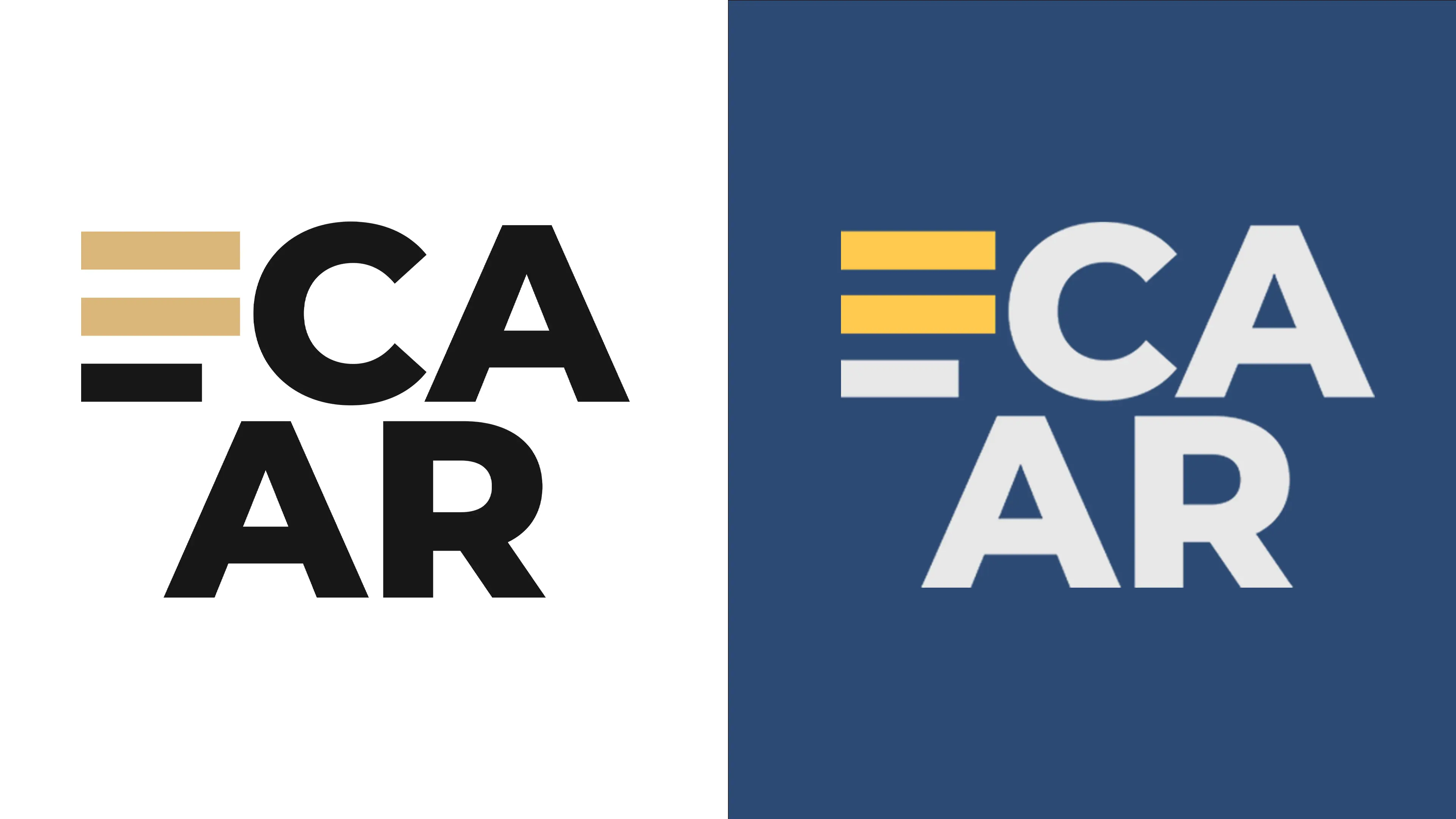
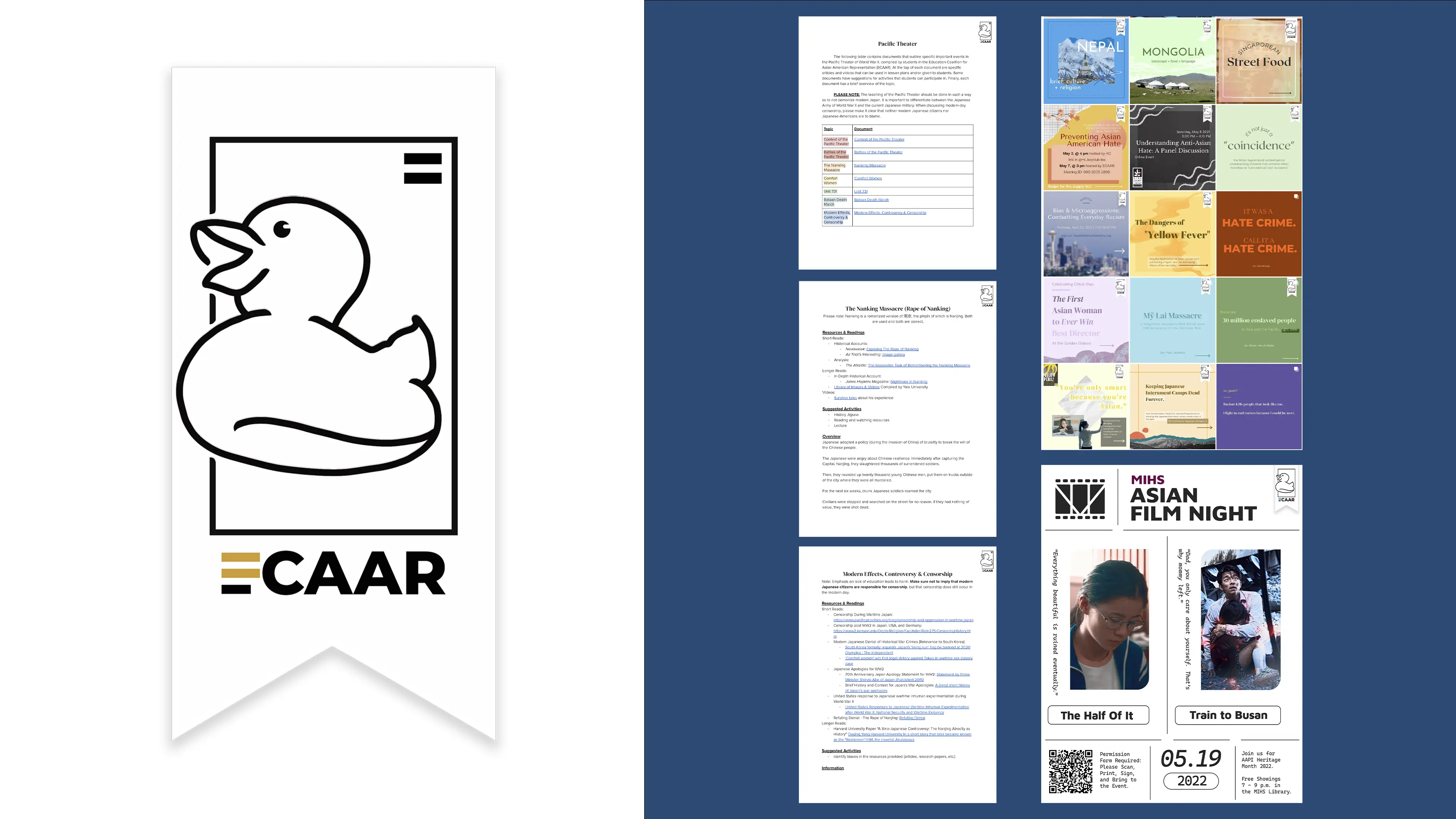
WATERMARK
Content-focused signatures
Because ECAAR creates educational resources, there are a couple of good reasons to create a watermark. First, watermarks prevent others from stealing design and research-based work from students of ECAAR. Second, watermarks create a universal brand identity across student-created work, which tends to vary in tone, aesthetic, and overall style.
The watermark design aims to be iconic but not distracting and easy to add to any piece of work. As such, I worked with neutral colors and avoided designs that would require students to adjust opacity for use.
STICKER ILLUSTRATIONS
Stickers for mass-appeal
Stickers are fun and provide inexpensive advertising for the club. We used stickers as freebies during fundraisers and encouraged members to put them on laptops, tablets, and water bottles. The illustrations were eventually used for advertising on posters and handouts.
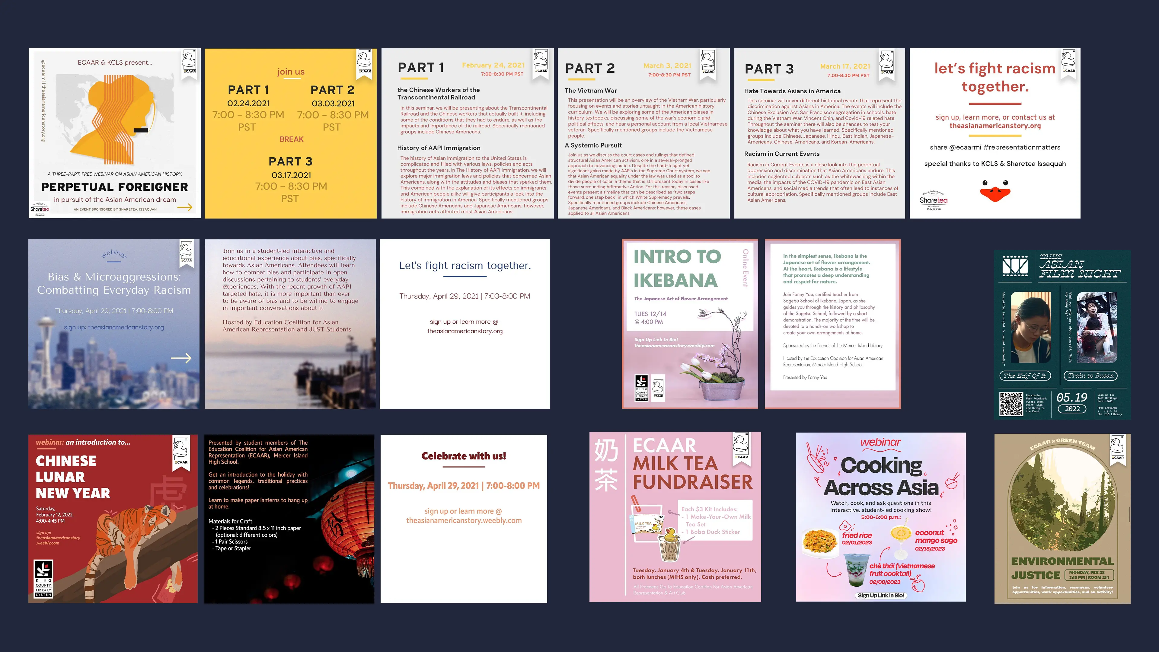
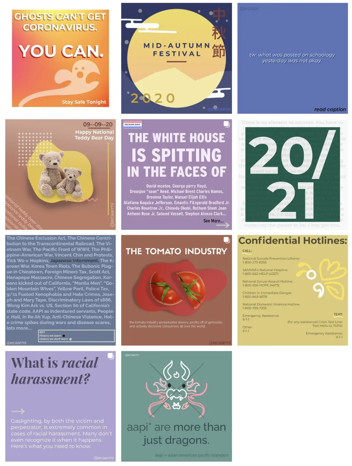
SOCIAL MEDIA
Educating in the classroom and online
Part of our early philosophy for the club was to utilize design principles to educate people through social media. We taught members to use research, visual hierarchy, color, symbolism, and imagery to tackle important issues. Members of the “Instagraphic” squad conducted research on subjects they were passionate about and the audience was educated on those subjects. Eventually, we shifted towards more in-depth research and event planning, but still used social media as a primary medium through which to advertise.
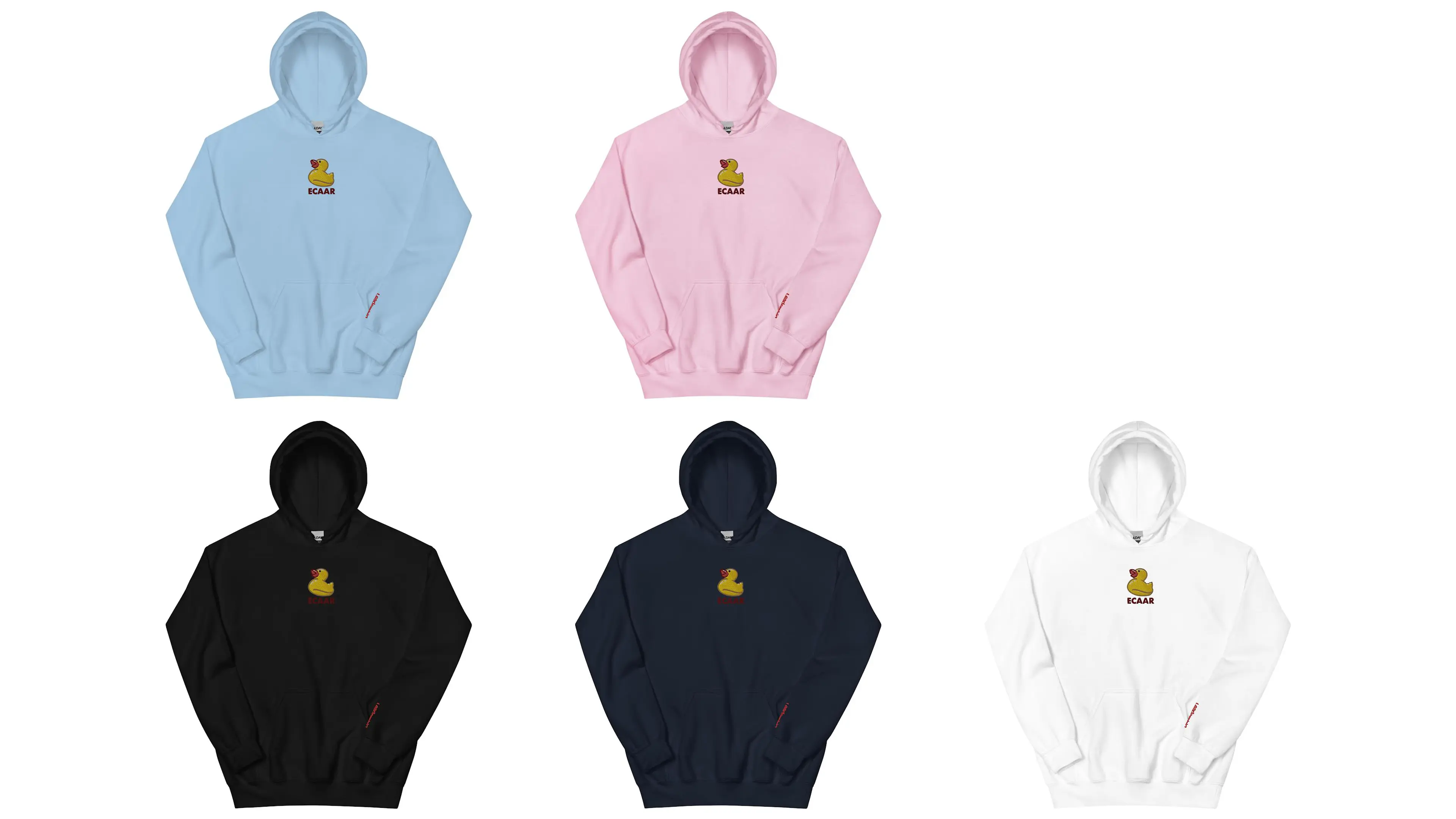
MERCHANDISE
Leadership members bought hoodies to promote events. The ECAAR duck is embroidered in the center of each. While these were also sold to members, only leadership hoodies have “Leadership” embroidered on the cuff.
MISSION POSTER
.webp)
PROCESS
Iterating for inclusivity
ECAAR’s early brand identity was a retro-inspired text treatment. While the lantern motif was interesting, the silhouette of the design was confusing. There were also too many colors, which led to issues with the cost of merchandise, printing, and brand cohesion.
In ECAAR’s first year, we handed out mass-produced flyers at our school’s fees and photos day. We aimed to spark curiosity but later decided that this approach was overly complex and did not resonate with our community. We shifted instead to colorful graphics, taglines, practical deliverables, and action items.
The original “ECAAR aesthetic" was made up of a controlled palette of colors and symbols. While it looks cohesive, it proved very difficult to ask members to sacrifice their personal styles and preferences. To address this problem, we created the watermark and allowed members to take creative initiative in their designs.
The rubber duck was originally an idea for a unique logo mark for our first webinar series, “Perpetual Foreigner.” We liked the color, symbolism, and memorability of the rubber duck. Since we were already looking to change our logo, I worked to adapt the idea into a workable and versatile logo.

2. Night Market
OVERVIEW
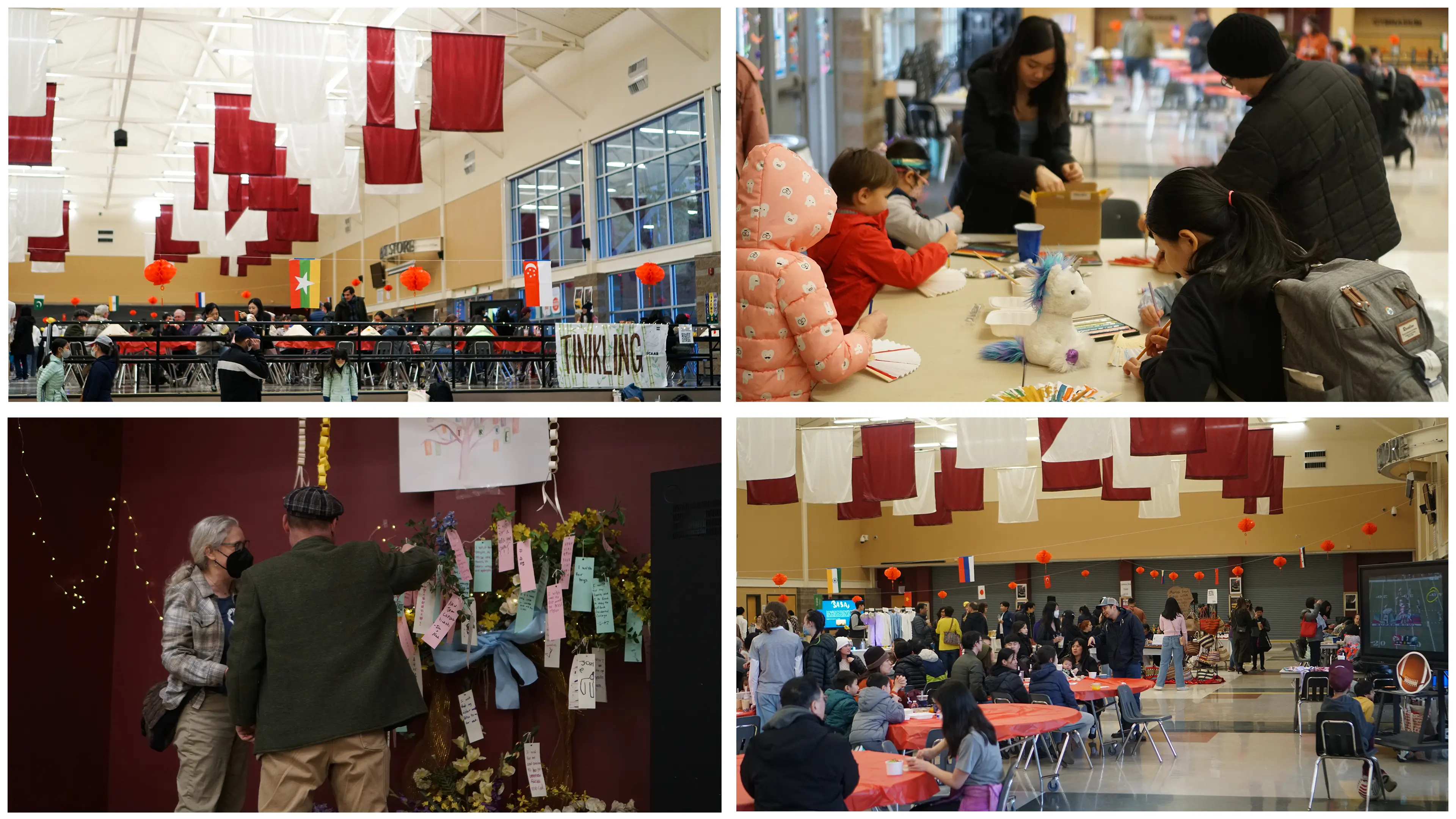
Mercer Island's first night market
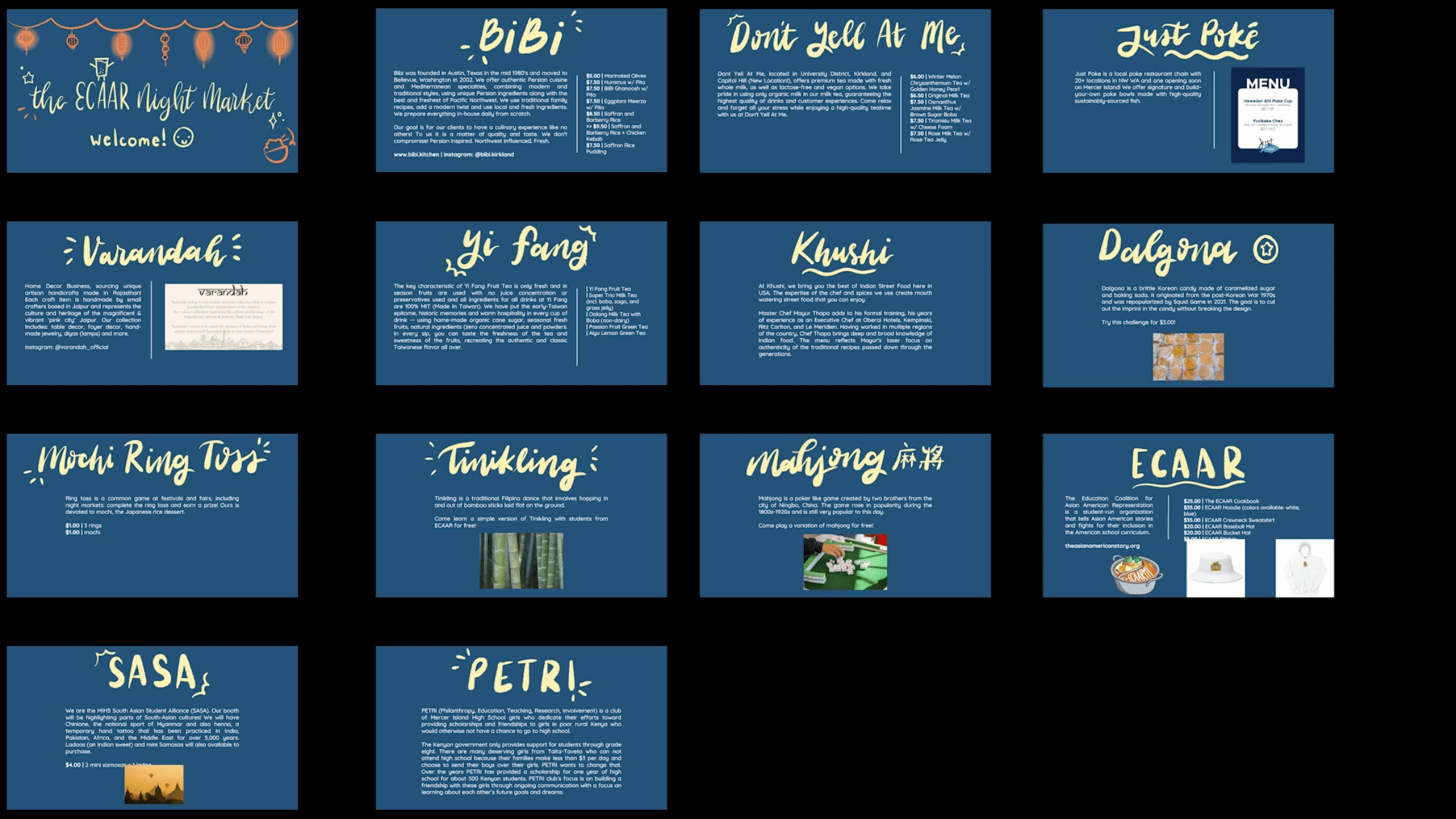
A Taiwanese-inspired night market. Six local Asian-owned businesses and three non-profits sold products or entertained during the five-hour event. I was responsible for the design, advertising, financial management, and outreach for the night market. My goal was to bring diversity to my school and educate the community on a unique part of my culture, with the added benefit of helping promote local businesses.
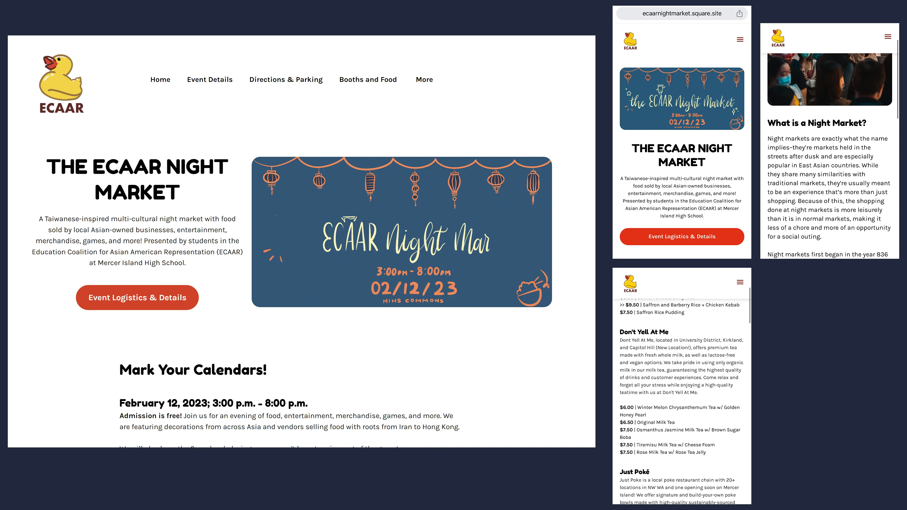
I designed all promotional materials and merchandise, including our event website: ecaarnightmarket.square.site. We promoted the event heavily on social media, especially through groups like the high school or local nonprofits.
We had a total budget of $1980, with our goal being to break even. Over 700 people attended the event and participated in various cultural activities like Tinikling, a Filipino dance, or creating a wishing tree. This was double our attendance goal, and nearly every booth sold out of product within three or four hours. It was a very successful night: with donations, we made over $200 in profit for the club, and businesses were able to keep all of their respective profits.
IDENTITY & SLIDESHOW
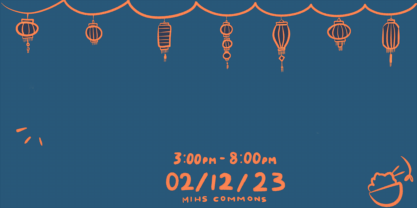
Motion-based touchpoints to spark excitement
Since this was the first ever night market at Mercer Island, I used drawings to communicate the idealized imagery and energy of the event. I included motion to improve brand digestion and draw attention.
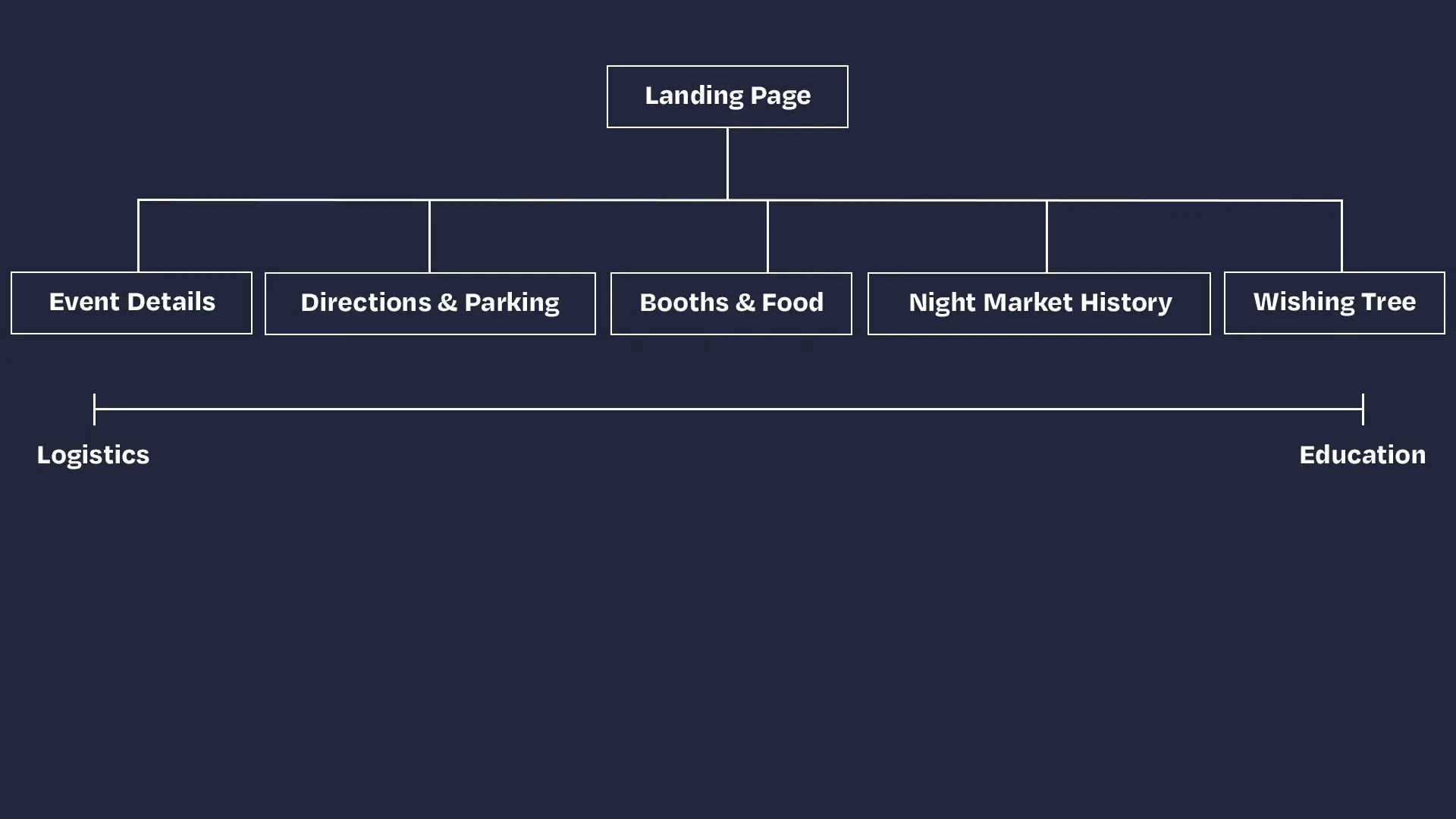
INTERFACE
Usable, accessible UX
I built the website to communicate information in a simple, credible way since our target audience spanned several generations. Page names were kept short but descriptive. We organized the pages from logistics, which we thought would see the most traffic as users navigated to the event, to educational resources, to which we thought users would not need to frequently return.
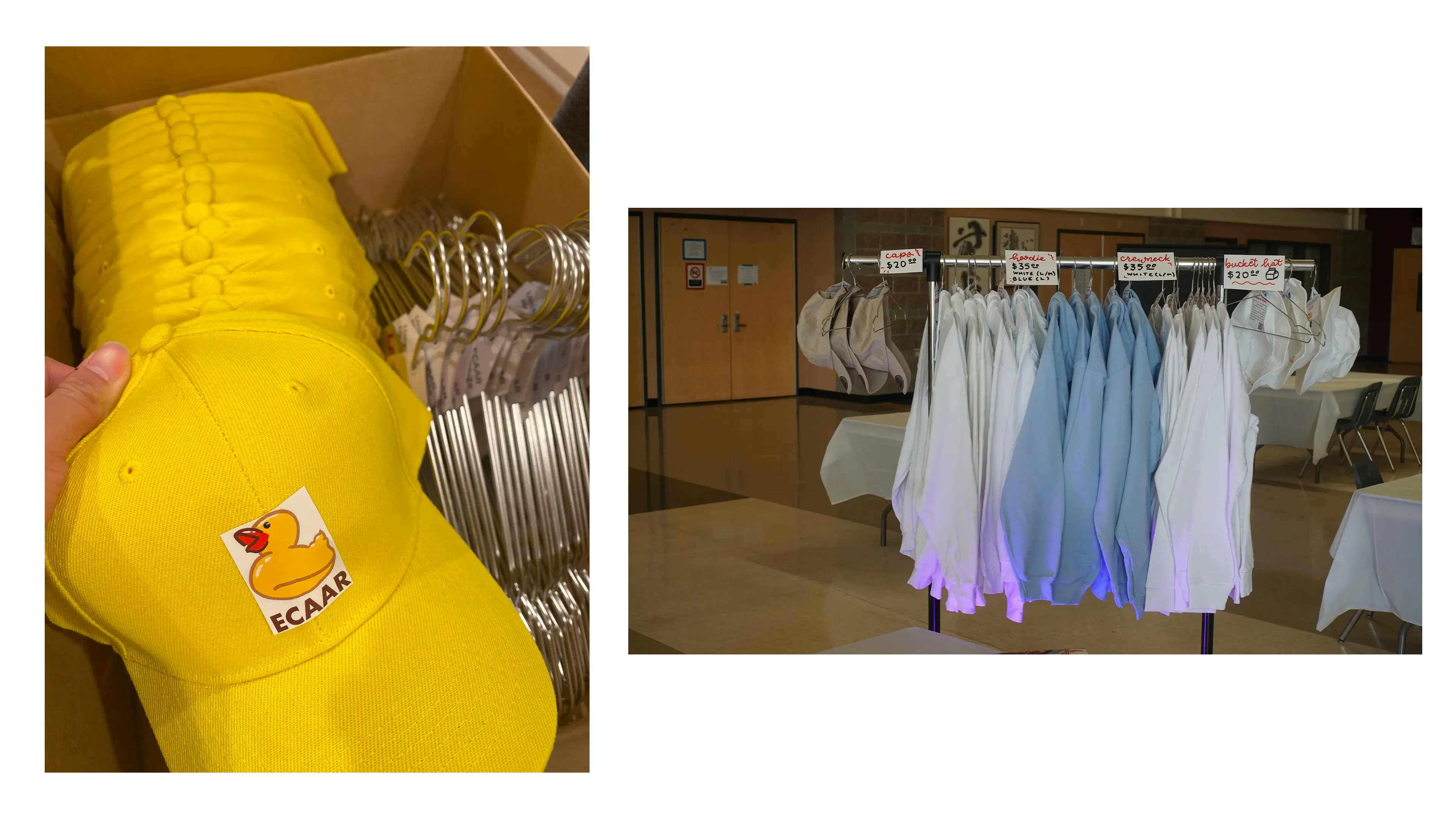
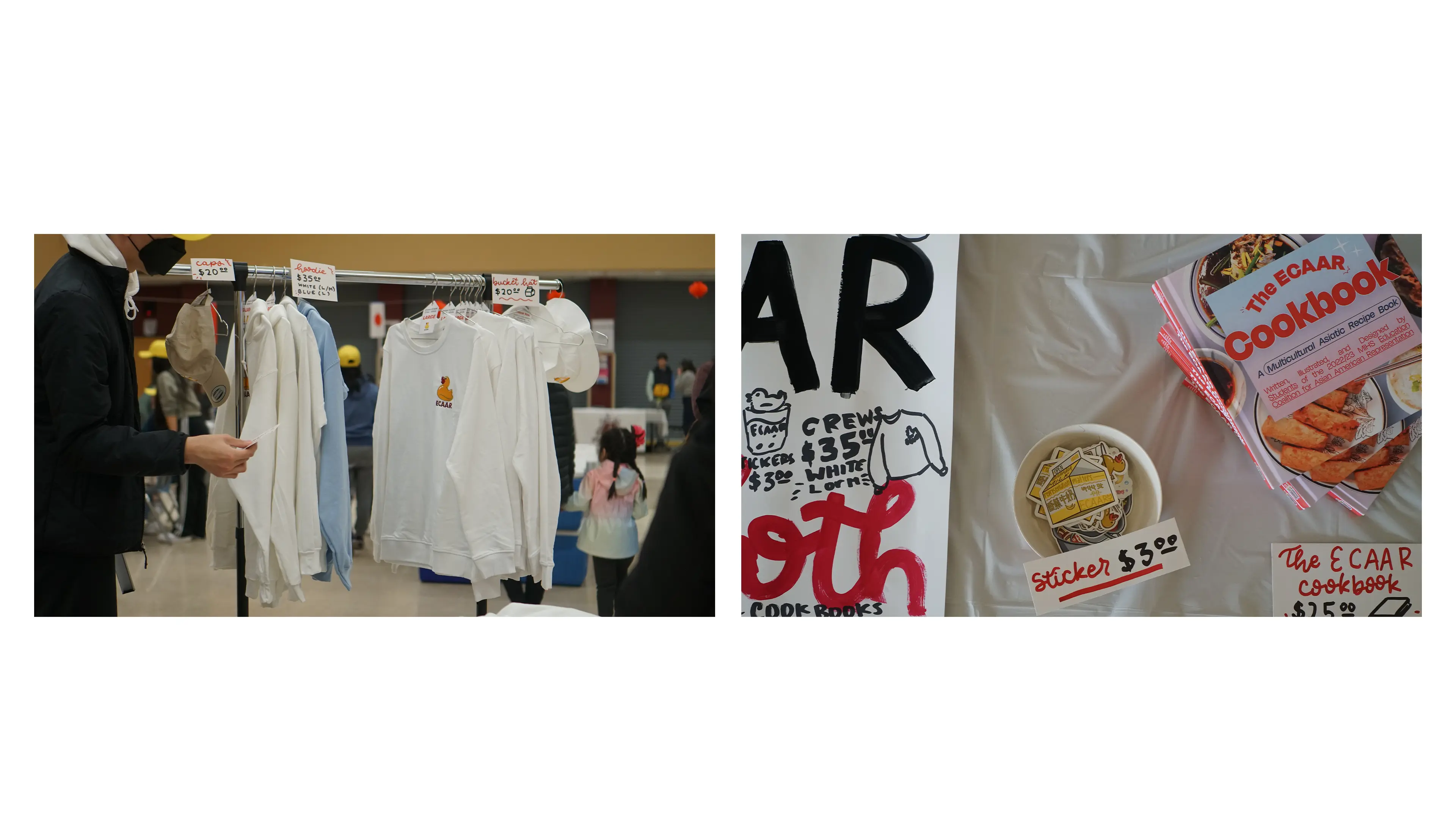
APPAREL
Collateral to last
We designed a lot of merchandise to sell at the event, which was our primary way of recouping the money we spent. We also created cheap hats for volunteers out of stickers and yellow caps so that attendees could easily seek information.
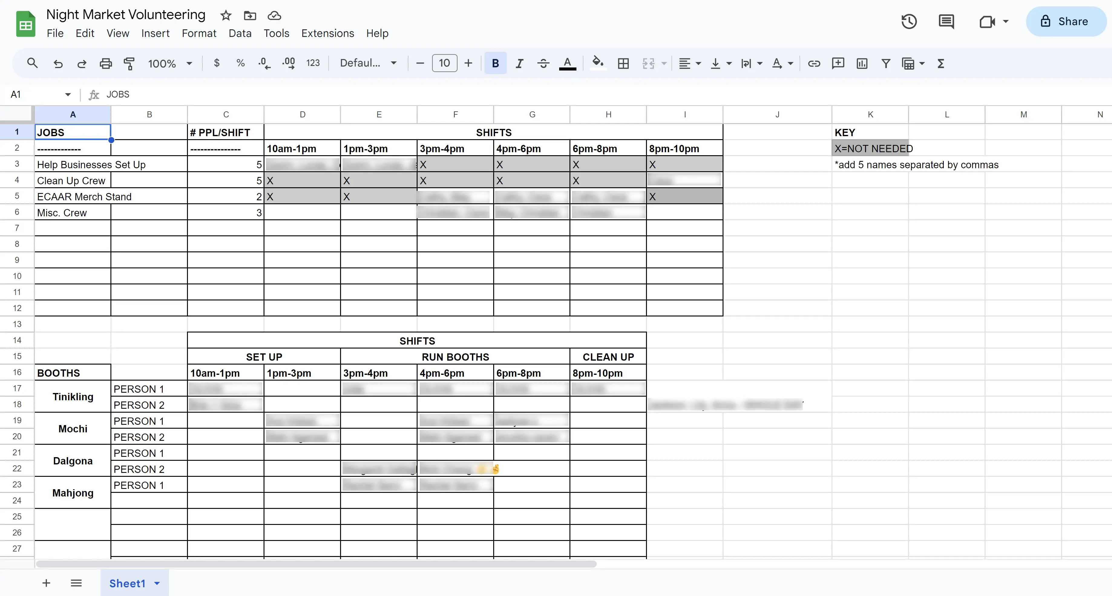
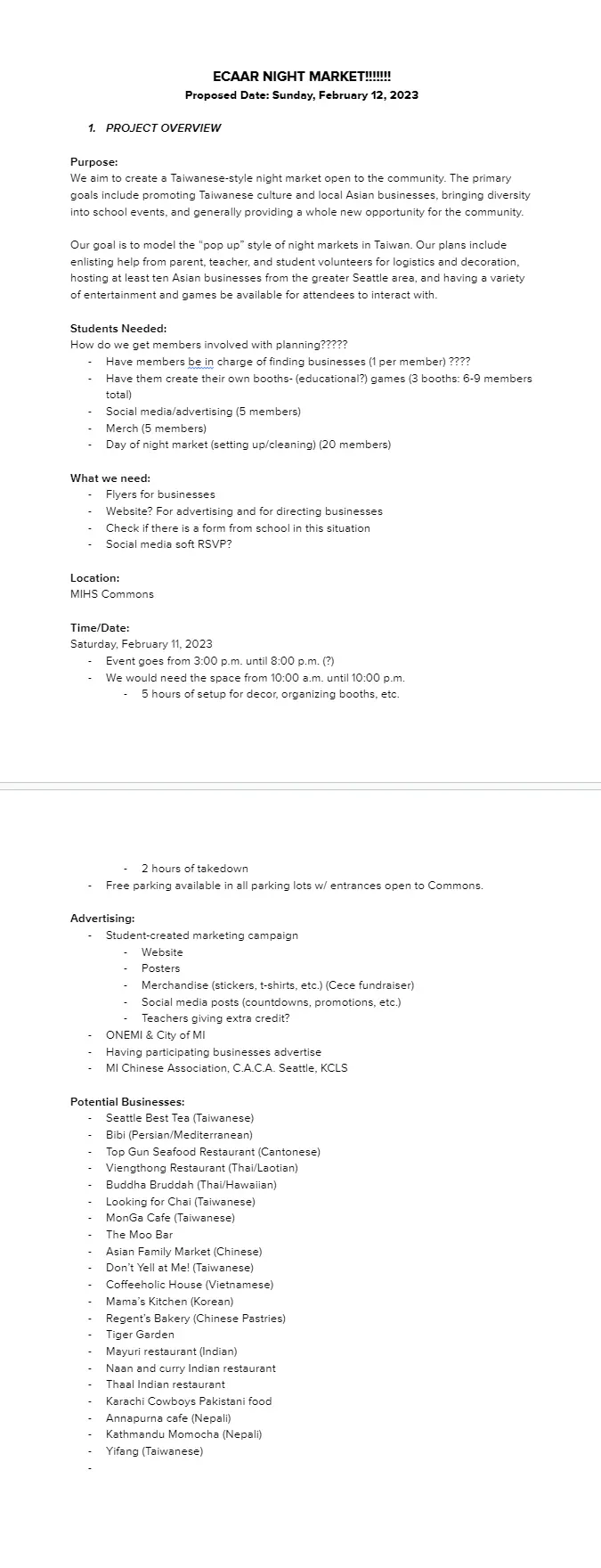
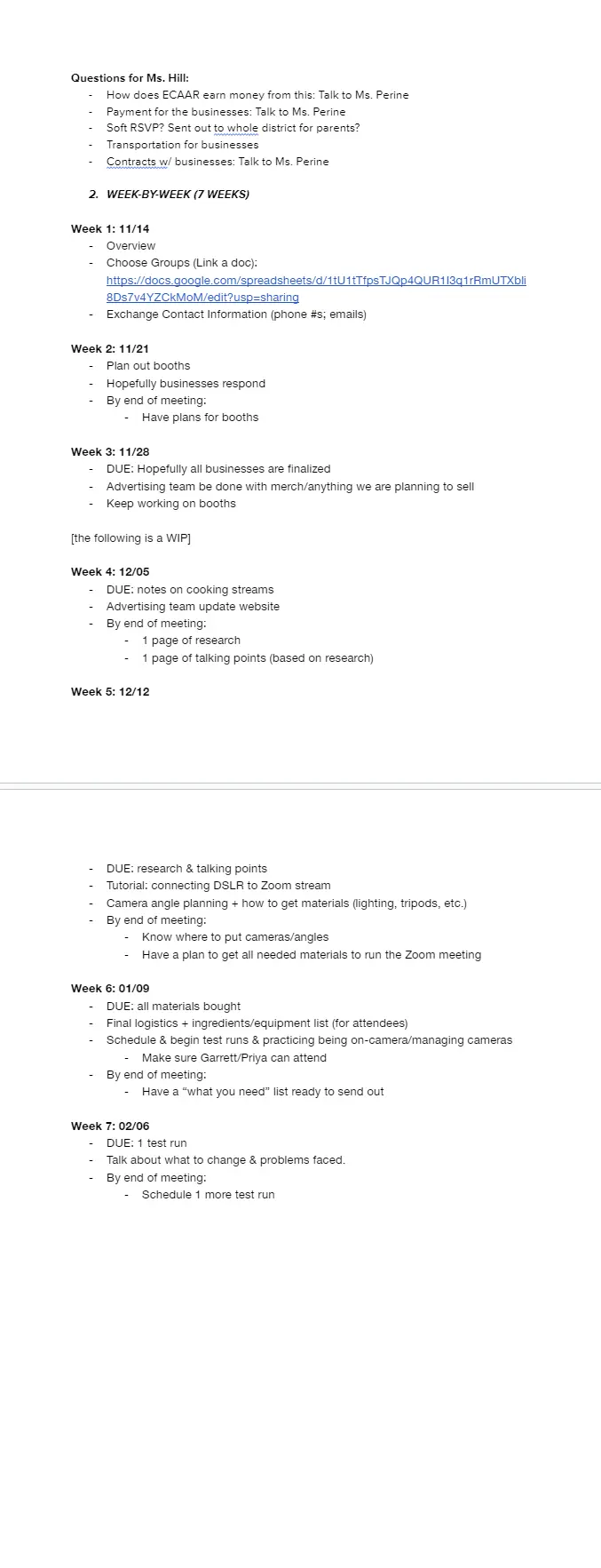
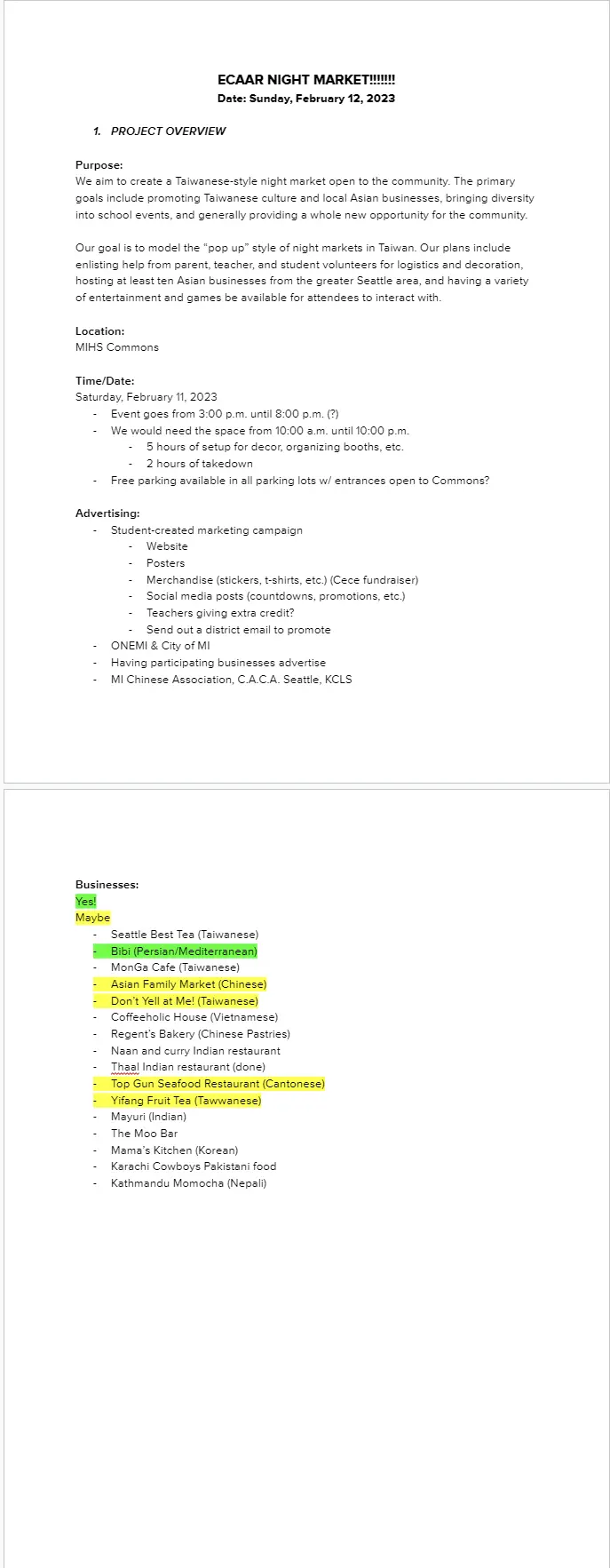
PROCESS
Organization, iteration, management
The night market required five months of planning with lots of spreadsheets and documents. Much of the planning concerned community outreach, then shifted to organizing people and communicating responsibilities.