ARTIFACTS
1. Brand Styles
2. Explorations
3. Reflection
IDENTITY • PRINT • MOTION
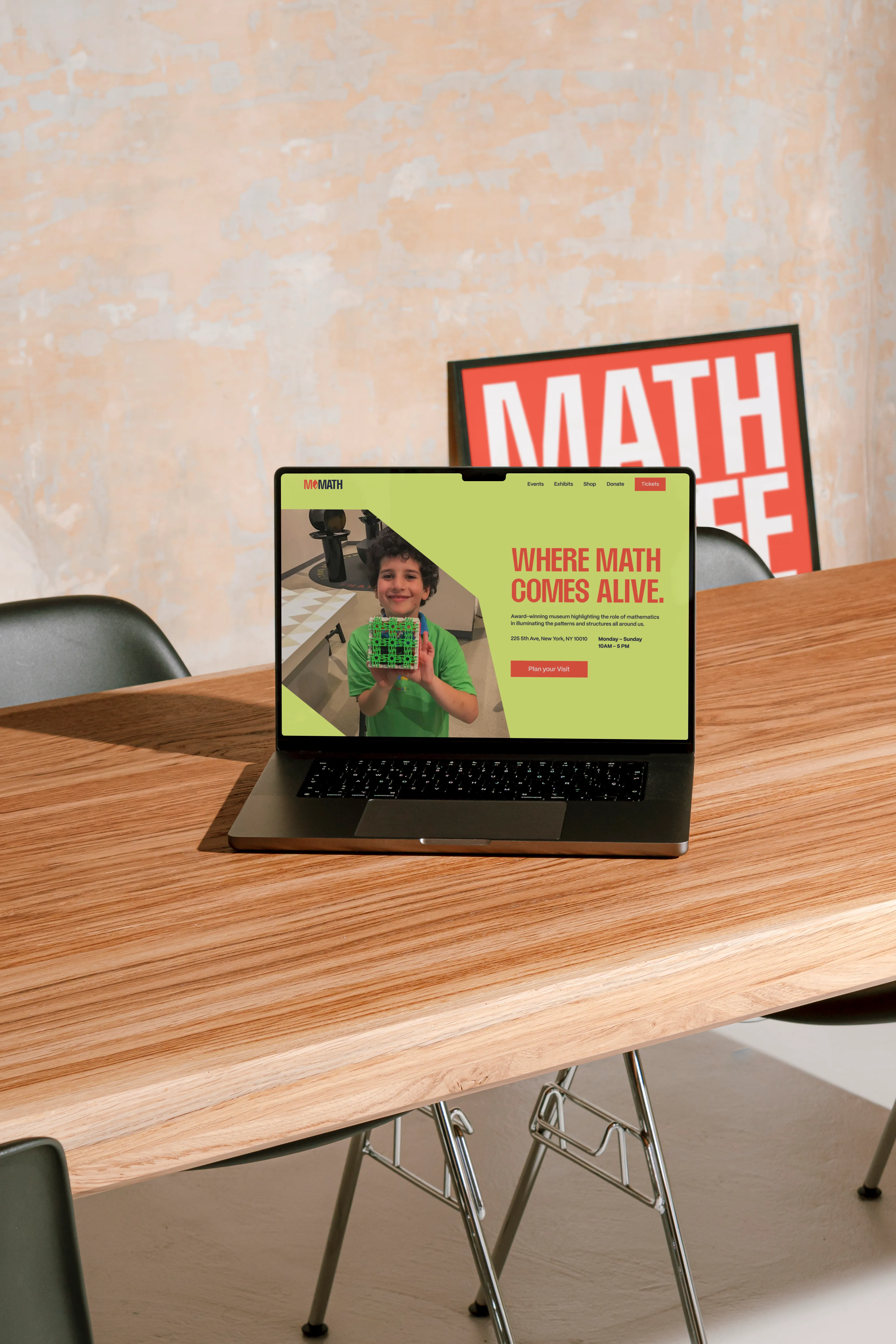
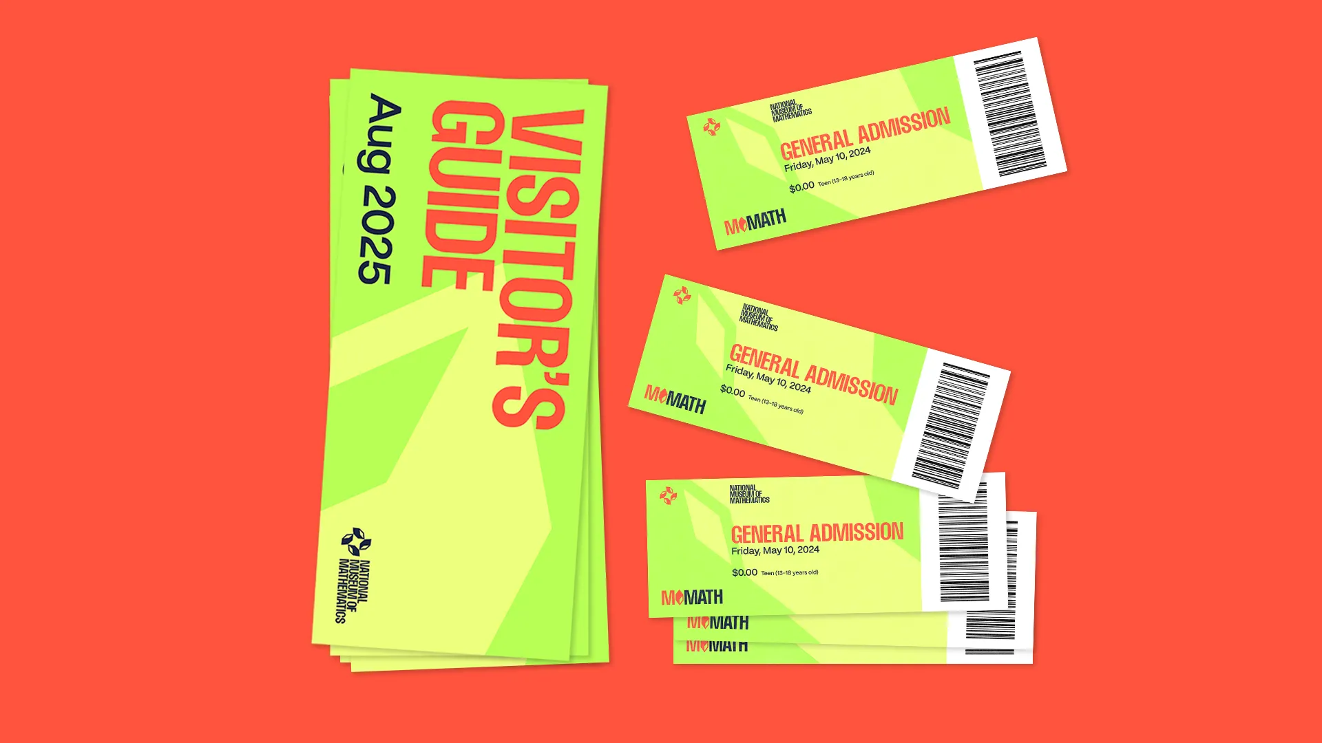
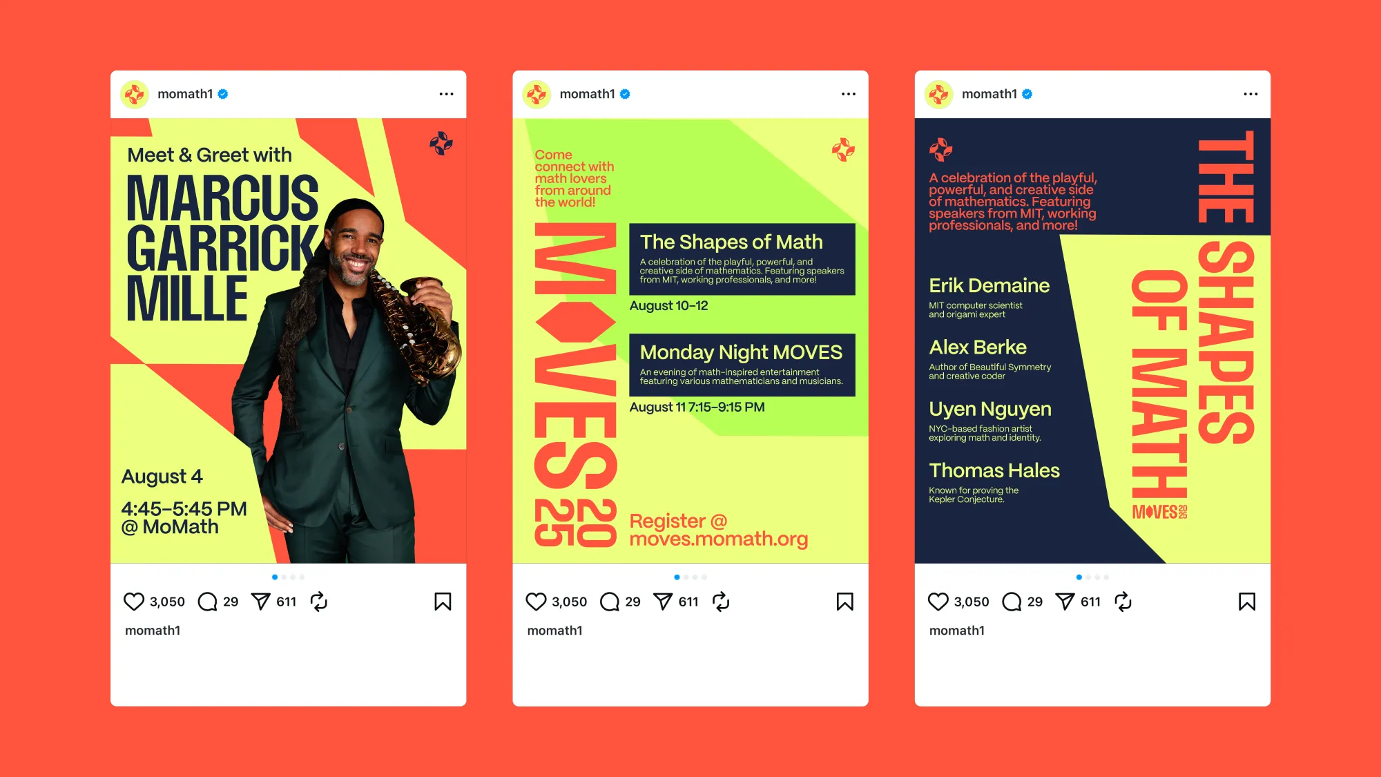
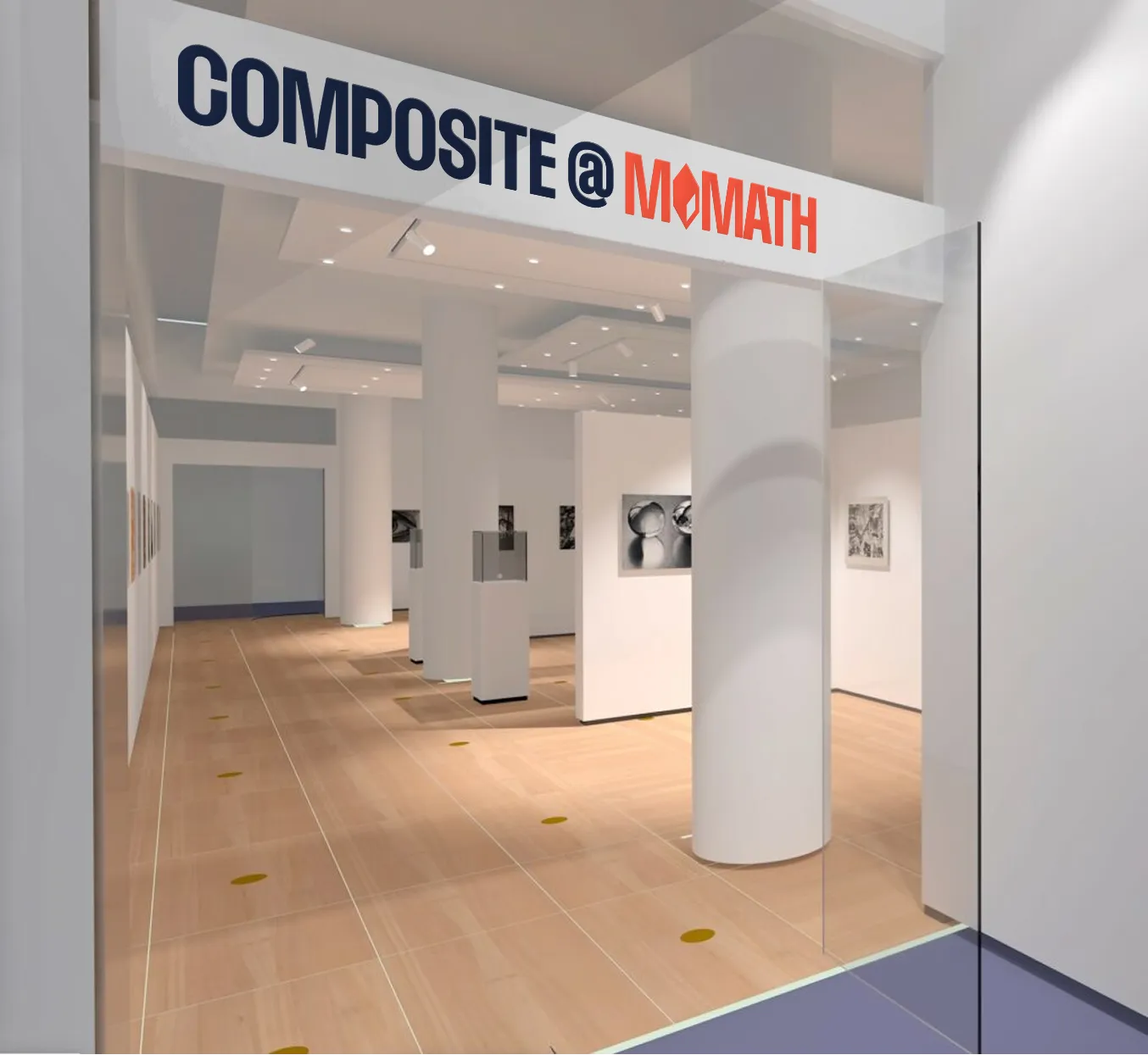
National Museum of Mathematics
An identity that sparks mathematical delight and curiosity for mathematicians and families alike.
TIMELINE-
July–August, 2025 (7 weeks)
TEAM-
Serena Cai
ROLE-
Co-Led Strategy and Design. Led Motion and Type Design.
CONTEXT
The National Museum of Math wants to make mathematics accessible, fun, and meaningful.
MoMath is a museum that claims to be "The Coolest Thing That Ever Happened to Math." Through exhibitions, activities, and showcases, MoMath bridges the abstract world of math to reality. While they are primarily a children and families museum, MoMath brings together people of all ages to celebrate and spark curiosity around mathematics.
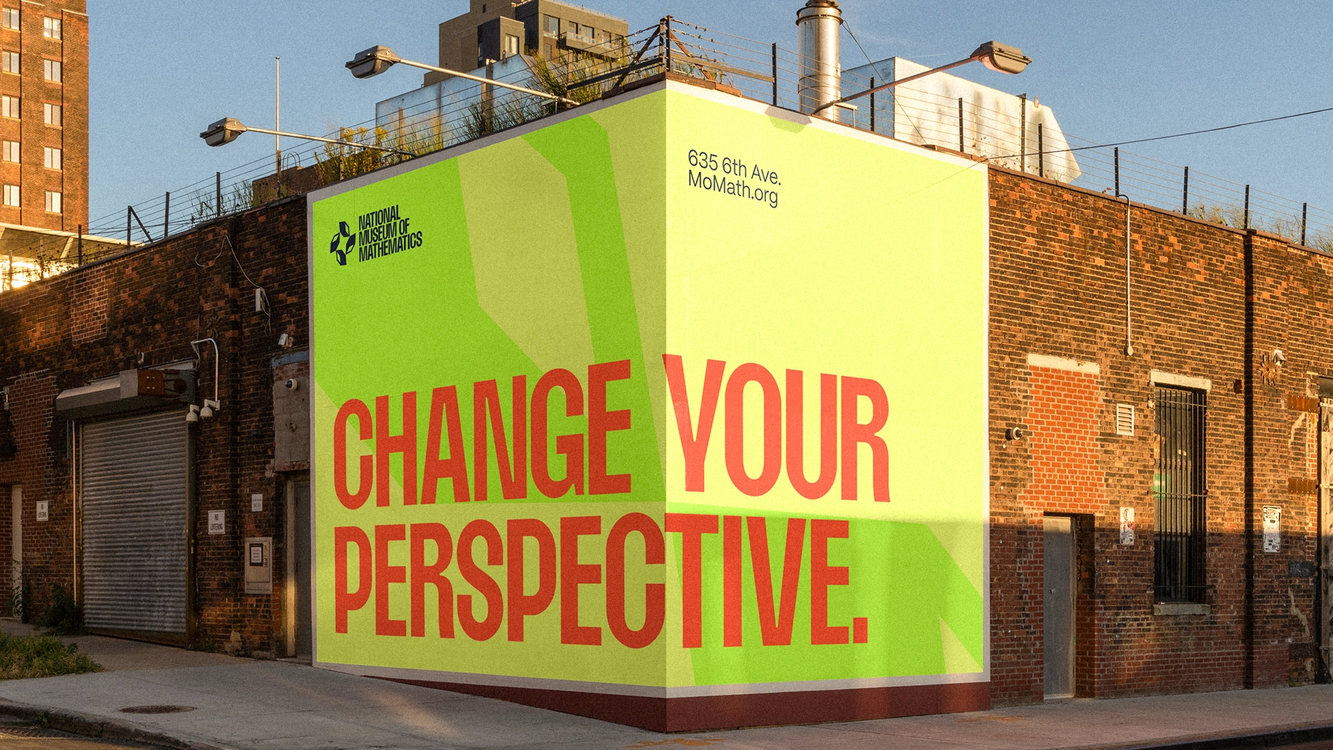
THE BRAND REIMAGINES MATH AS A BUILDING BLOCK OF THE WORLD
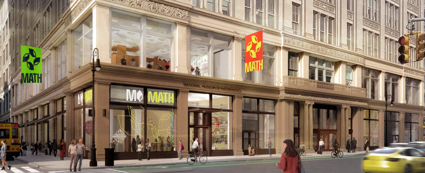
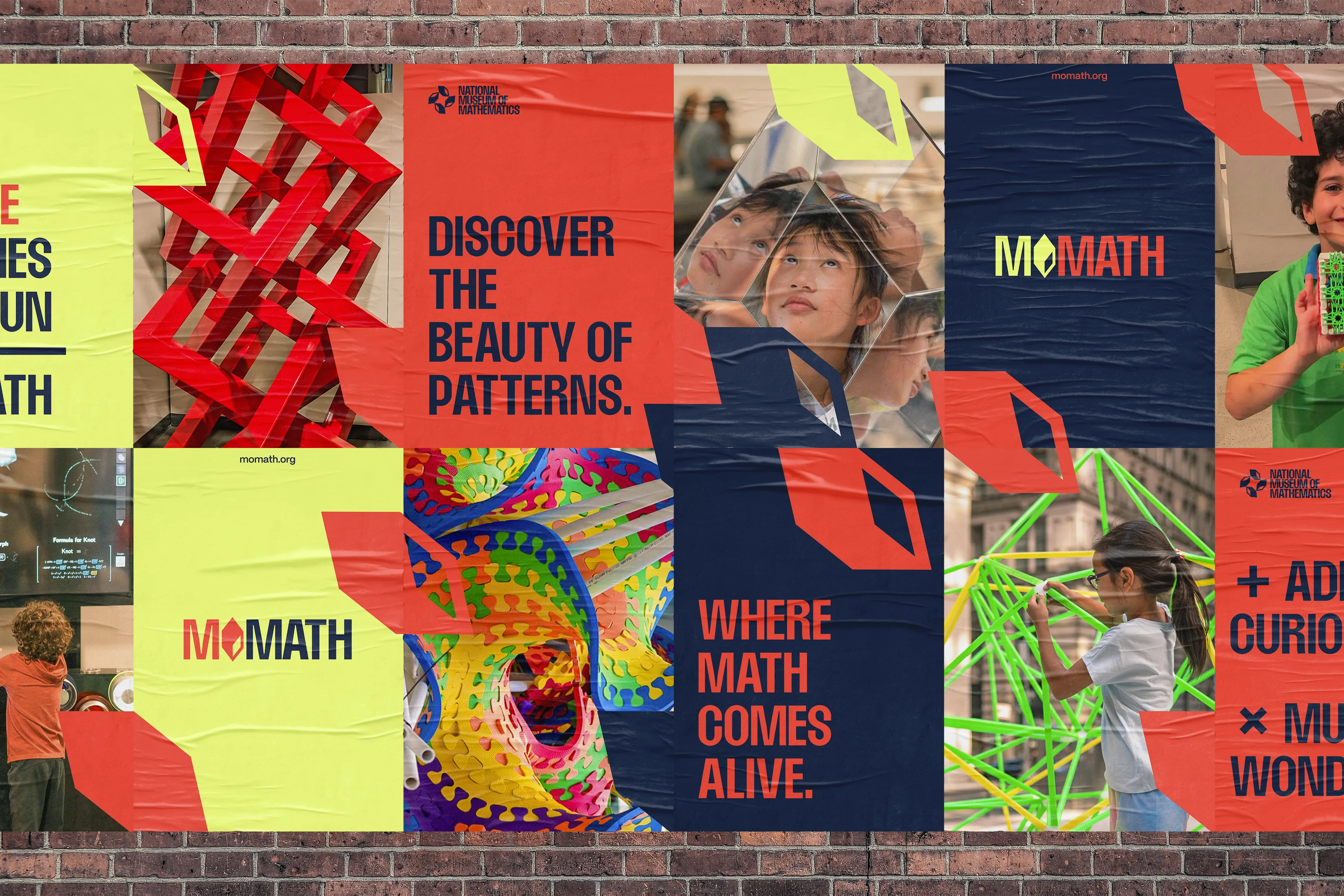
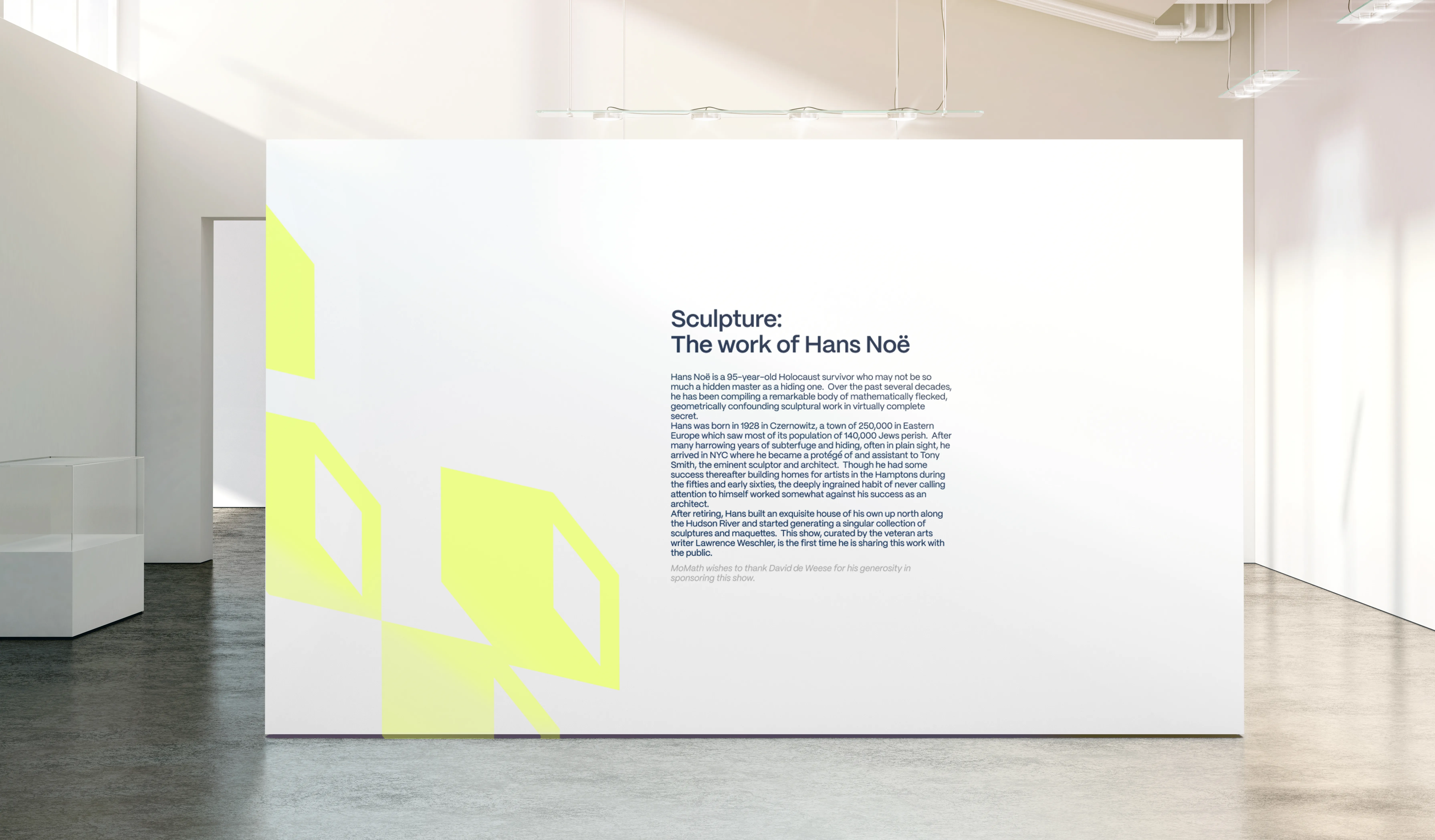
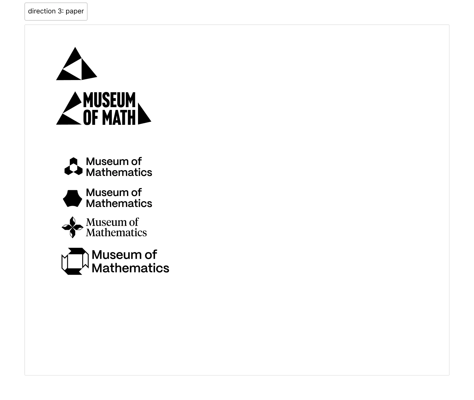
LOGO
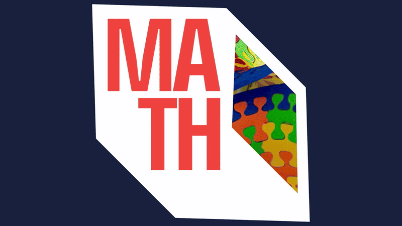
The icon is an abstracted rhomboid prism, encouraging viewers to see math from a new perspective.
Geometry is the first math children learn through play tiles and number building blocks. Geometry is also among the most grounded disciplines in math, so we felt that a building block of some sort served as a strong symbol of curiosity and practicality.
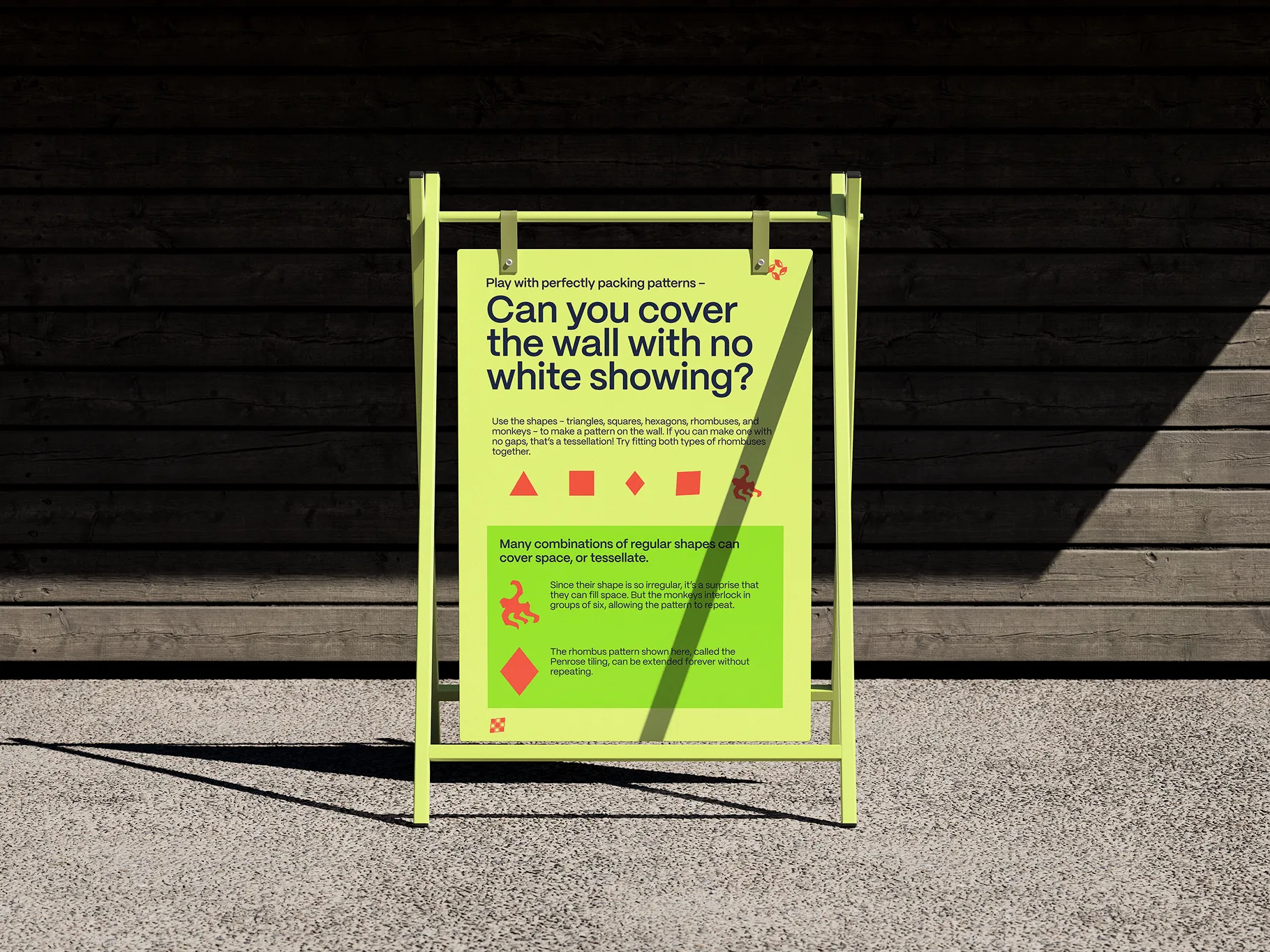
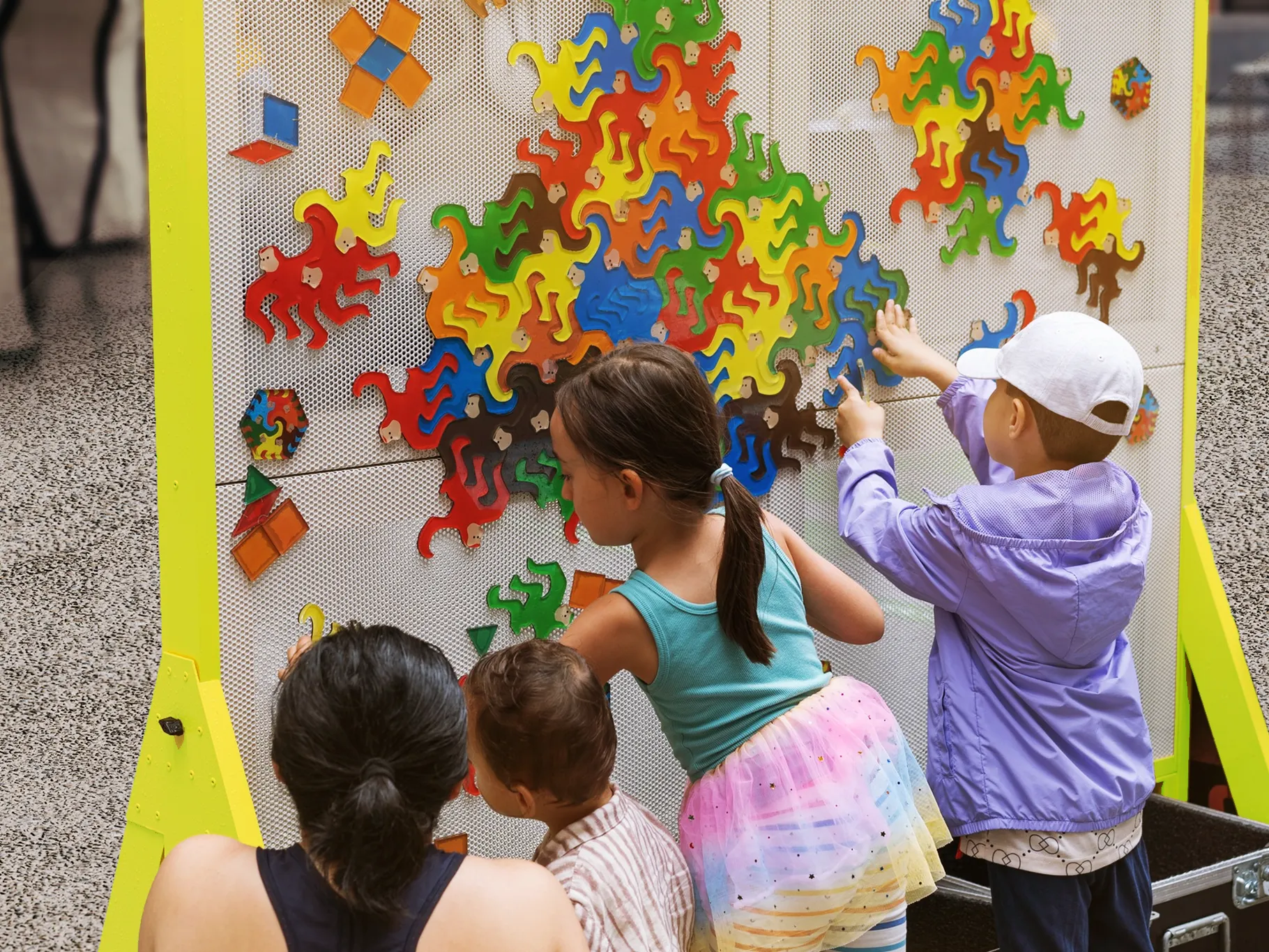
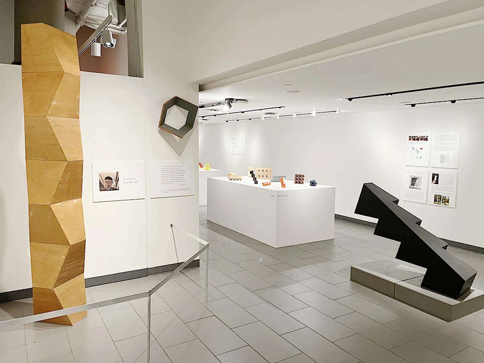
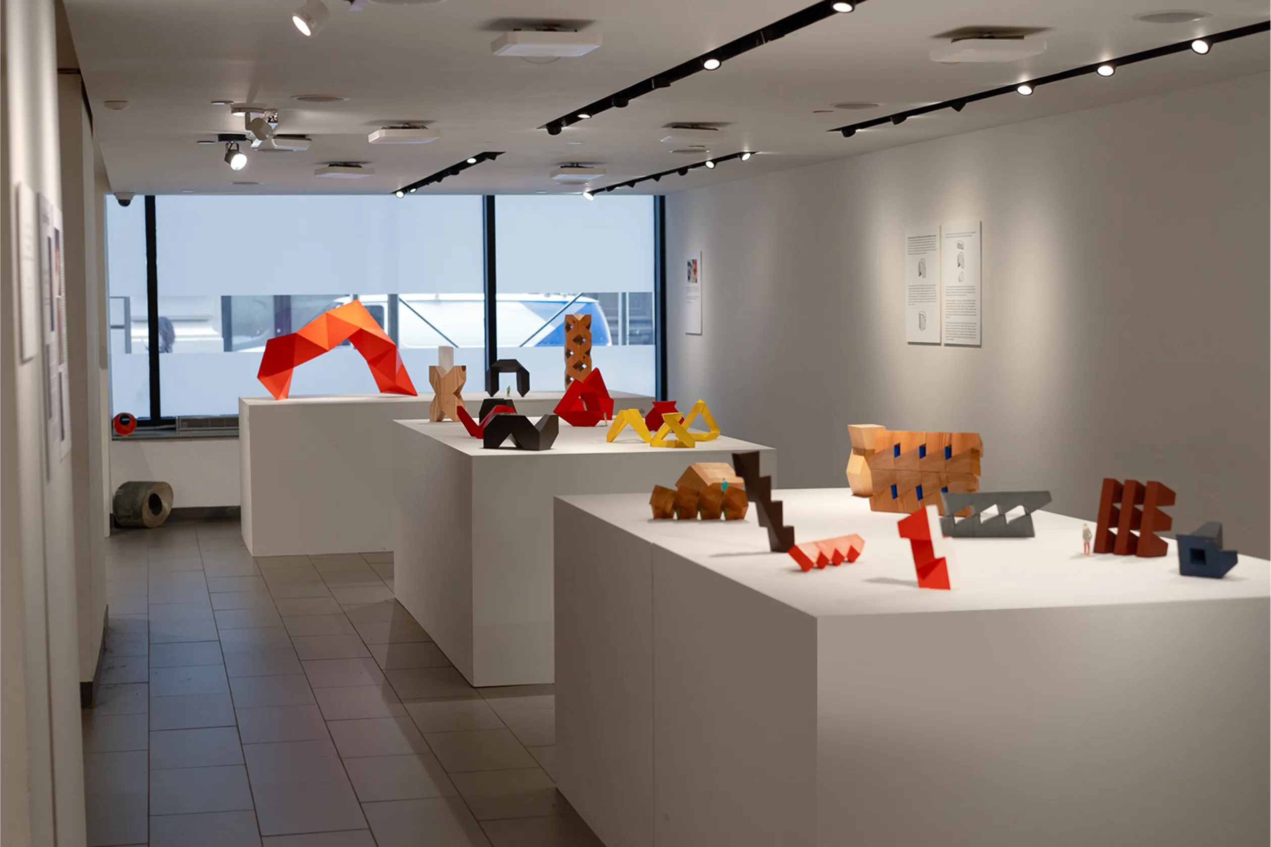
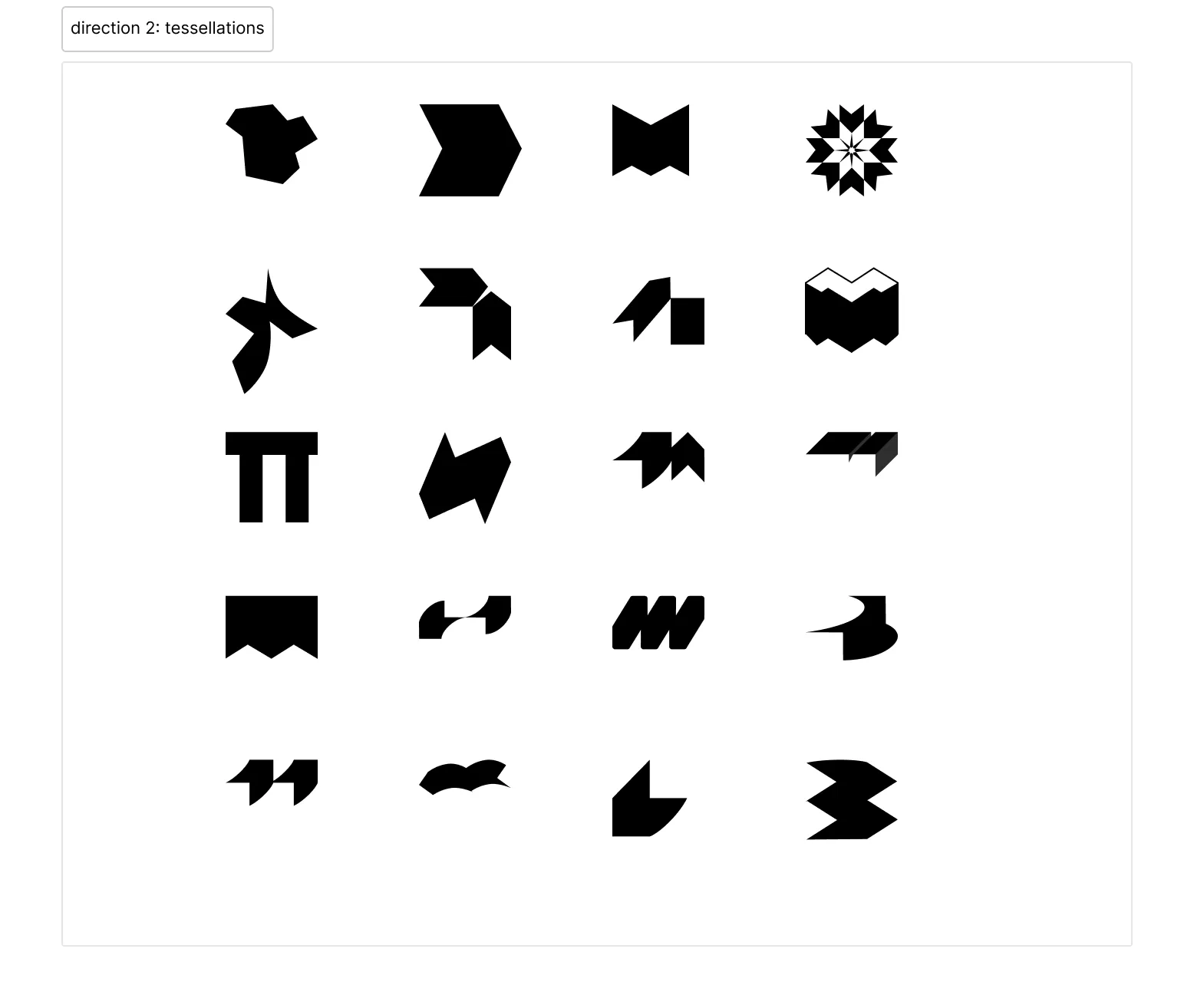
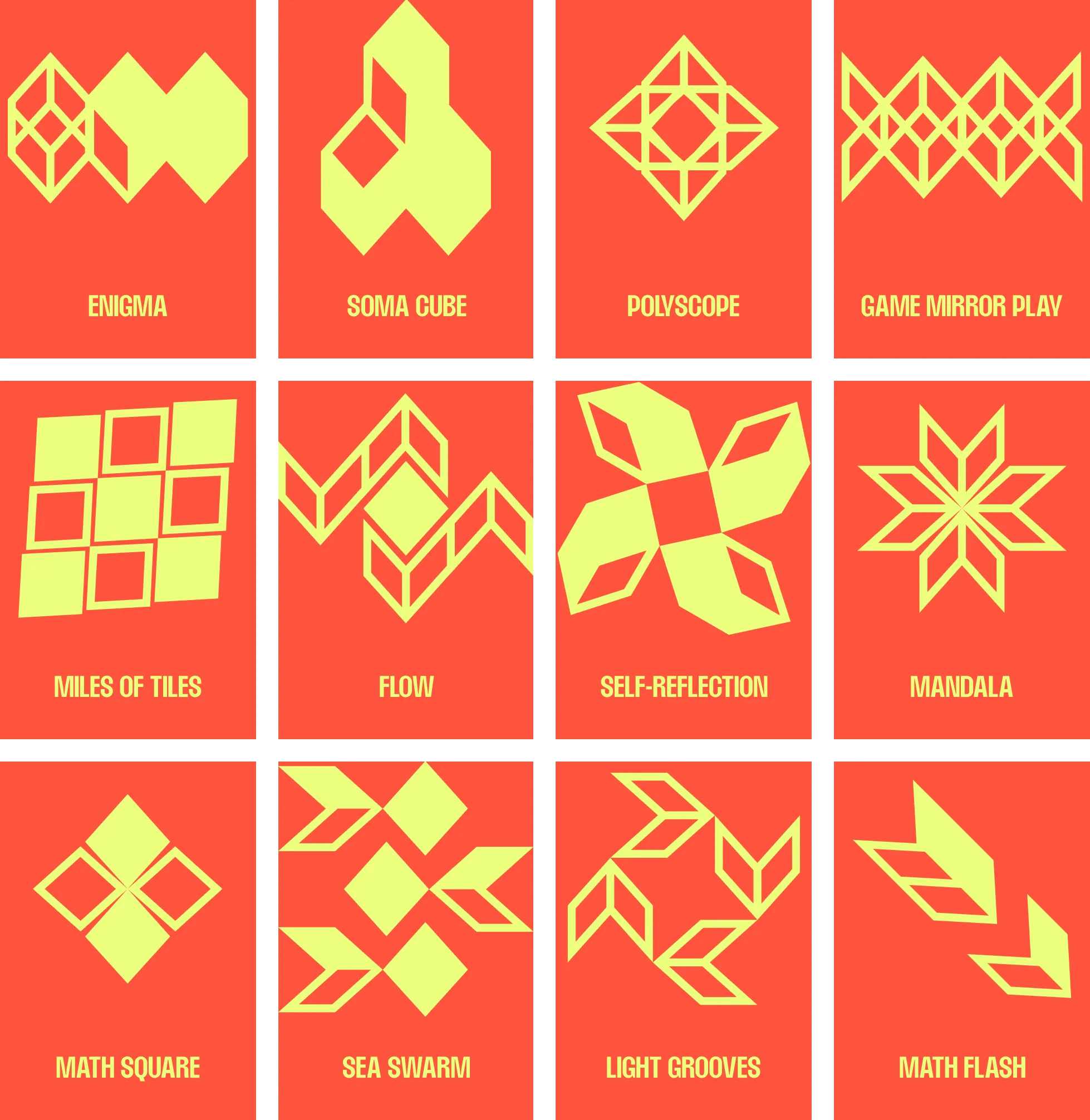
The icon can also be tessellated, divided, and rearranged to create delightful symbols for exhibitions.
The tessellation serves a double purpose. It allows for generative design, like in the case of exhibition icons, and it also serves as a motif for the interconnectedness between the math world and the real world.
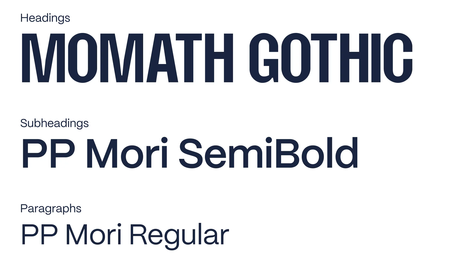
TYPEFACE
The header typeface is custom, a variation of Max Phillips' Field Gothic.
We added slight ink traps, moved crossbars up or down to align with the golden ratio, and moved the geometry of rounded letters closer to a normal circle to create a quirkier, math-based typeface.
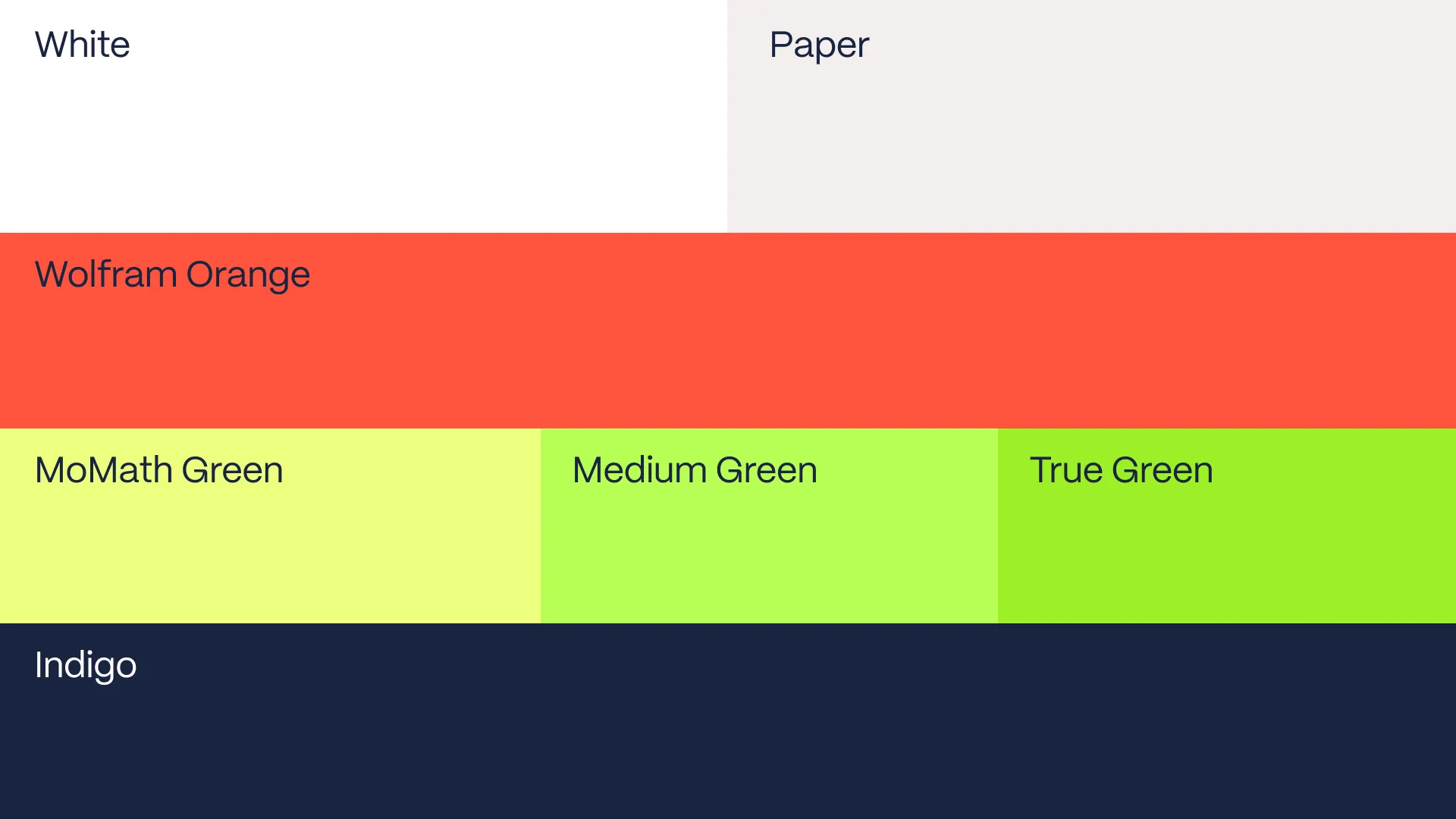
COLOR
The colors are adjusted from Wolfram Alpha's orange, paying homage to MoMath's origins, and built into a bright, refreshing palette.
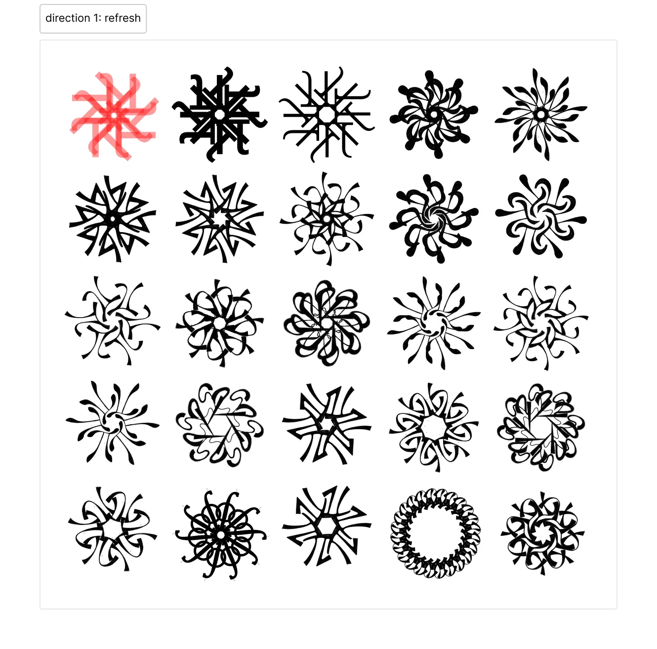
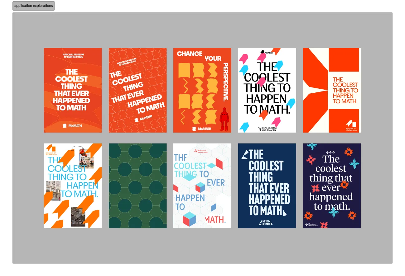
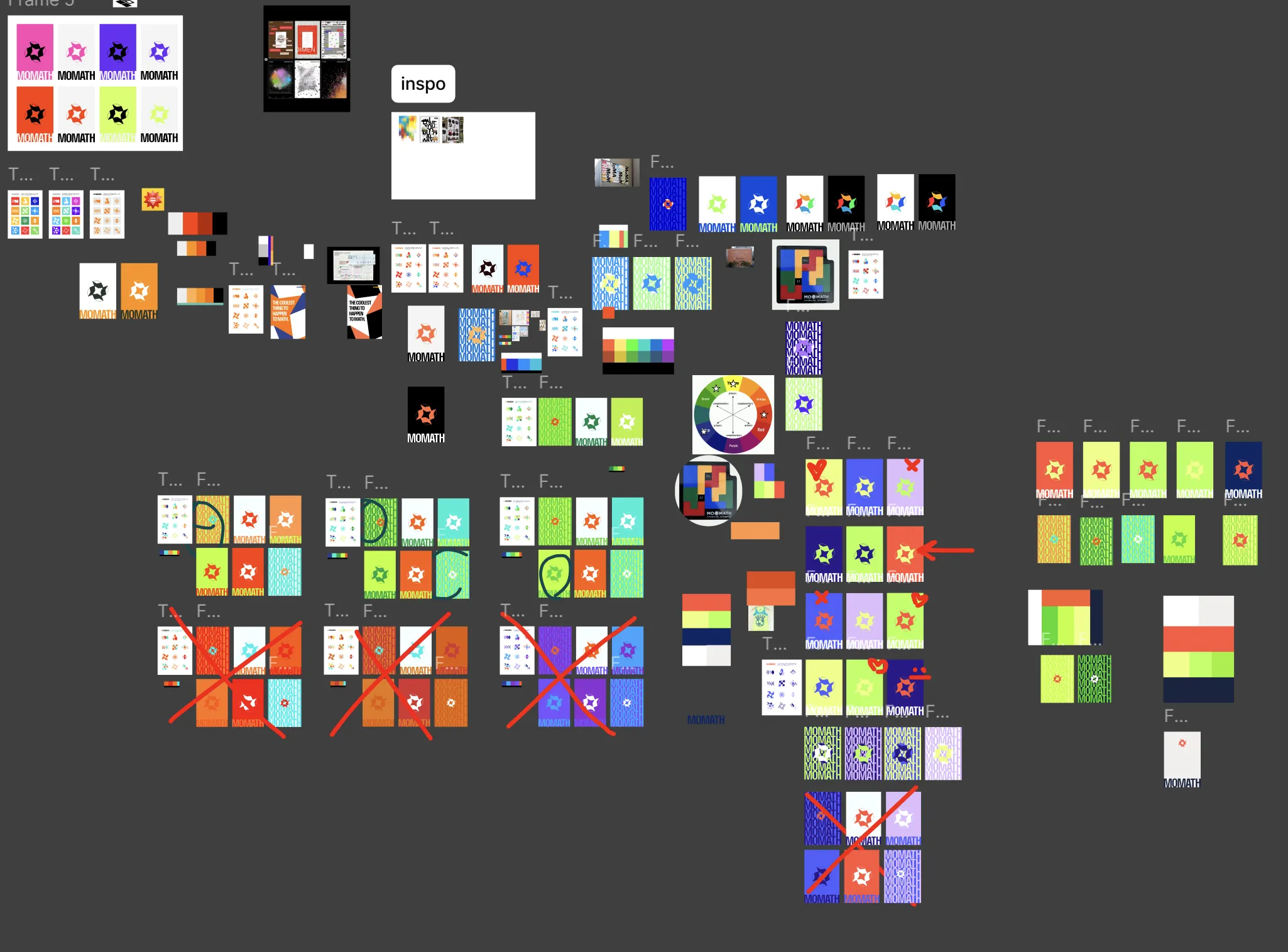
EXPLORATIONS
BASELINES
The identity had to spark curiosity, de‑intellectualize math, and remain versatile enough to delight at museum scale.
Through our research, we found the core tenets of MoMath to stretch far beyond simply celebrating math. Much of the programming is oriented toward making math accessible for everyone, even concepts that are typically taught at the college level.
THREE DIRECTIONS
REFLECTION
What a splendid time! I really enjoyed working on this project and talking about math. I felt like Serena and I worked well together and were able to set clear goals and expectations from the start of the project. Although I typically prefer to have independent worktime, having dedicated calls where Serena and I both worked for a couple of hours and could collaboratively make design decisions ended up being extremely valuable. Through this project, I was able to practice skills across the Adobe Suite, live-design on Figma, and learn how to create a font. If I could do it again, I'd practice client communication and verify our solutions by speaking to a couple of people who work at MoMath.