PROCESS
1. Identity
2. Application
3. Process
Identity, User Experience Design
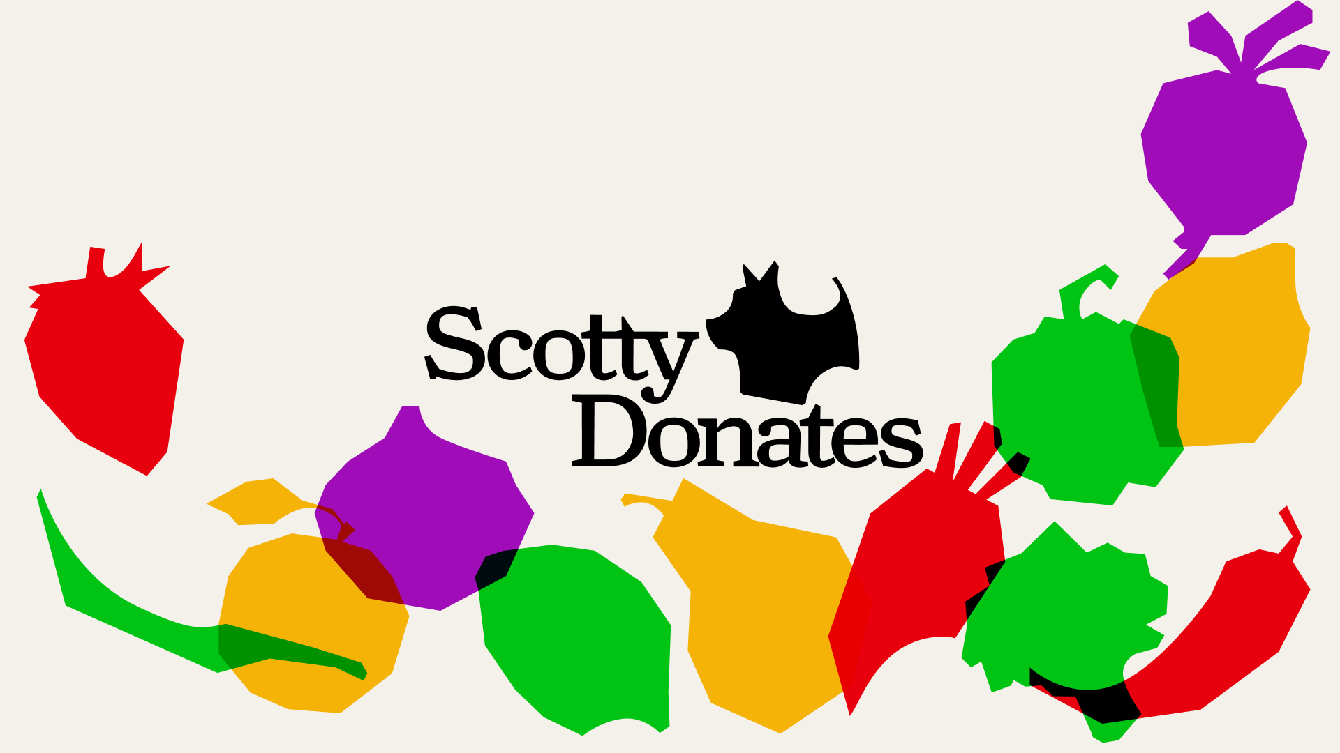
ScottyDonates
ScottyDonates is a phone app that aims to make donating a part of students’ routines.
.gif)
CONTEXT
How might we help people incorporate donation into their routine?
We used the motif of a farmers market to ground the app, playing on their connotations of community, exchange, and reliability. For the application, we used several persuasive frameworks to drive user habits.
1. Identity
BRAND SYSTEM
An identity that bridges in-person connection with a digital assist.
Inspired by the cut-out forms of the market sign, we repeatedly used cut-out curves to fuse the brand system. We tried to balance the insinuations of plenty, through chunky shapes, with efficiency, through the selected curves.
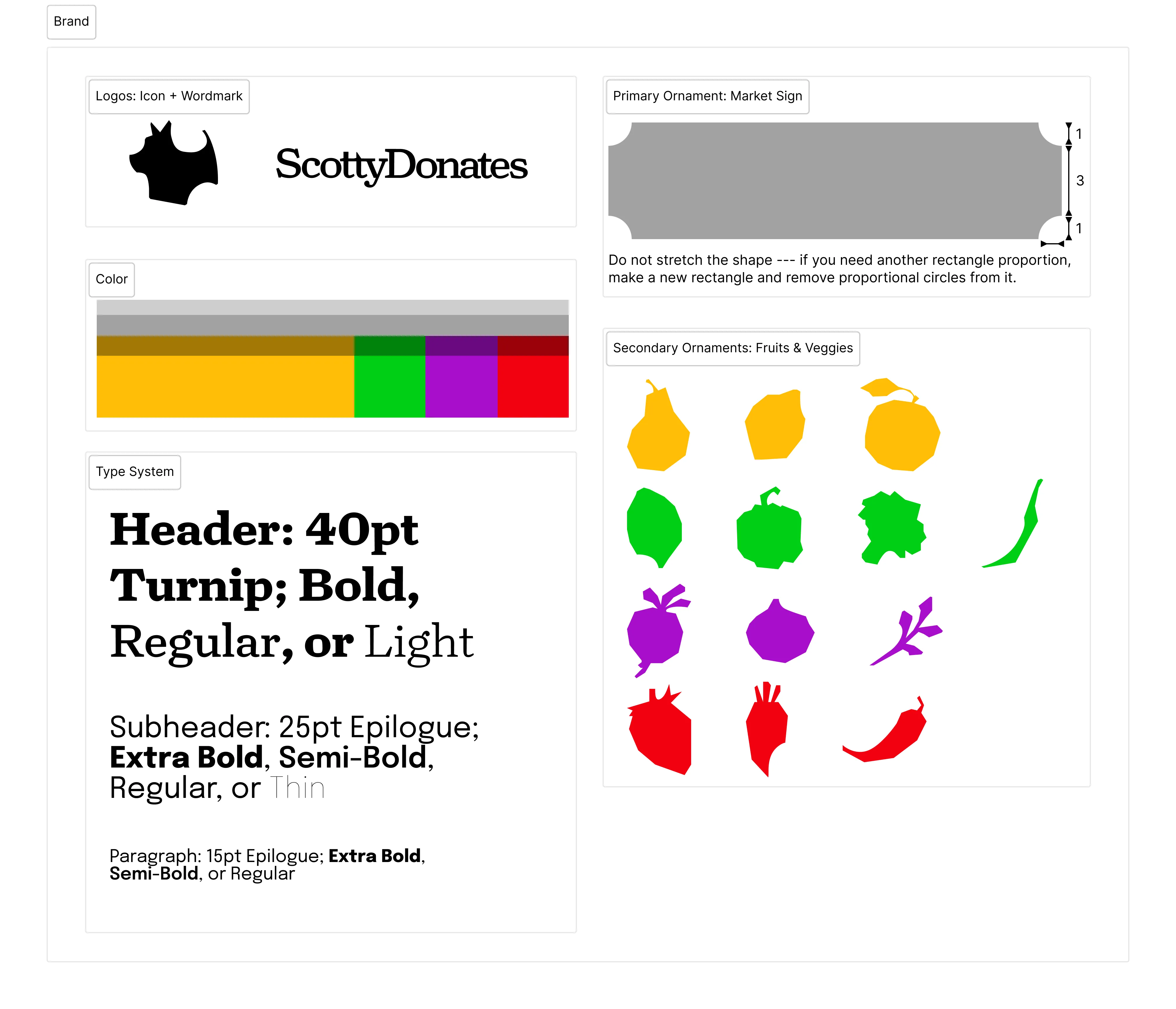
ATOMIC STRUCTURE
Atomic App Design
Since we worked as a team, and it was essential that elements remained consistent across the app, we developed atomic components to build the app.

2. Application
ONBOARDING
Onboarding that’s Simple & Personalized
Easily join communities and add your friends to ensure the right items end up in the right hands.

➡️

➡️

HOME
Home that’s Familiar and Efficient
Search, scroll items, and access messages easily.
Messaging is organized by whether you’re giving or receiving, and even further by item, not person, in case you’re exchanging multiple items with a single person.

➡️

➡️

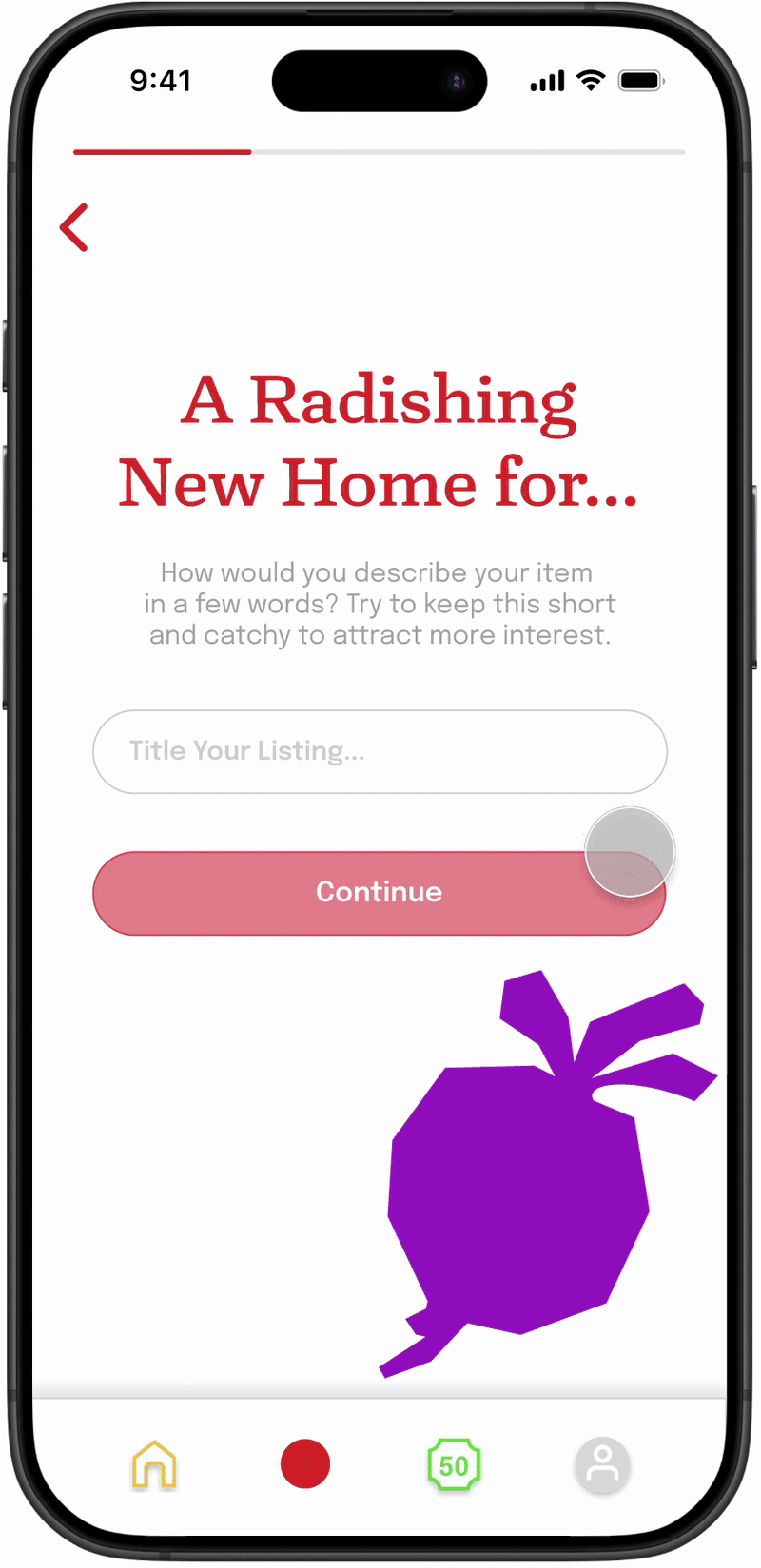
POSTING
Posting that’s Effortless
Posting an item to donate takes only three easy steps.
➡️

➡️

LEAGUES
Leagues that Keep People Coming Back
There are two parts to leagues: Streaks and XP.
Users keep up a weekly streak. If they post or receive an item, they extend their streaks to the next week.
XP is gained with pretty much any interaction in the app, and this is visualized with growing vegetables. You can see others with similar amounts of XP, divided in leagues.
Each week, if you have enough XP, you’ll promote to the next league. At any point, you’re able to see your vegetable having grown past lower-level leagues.

➡️

EXPRESSING INTEREST
Express Interest Quickly
Click to see more about an item, then send a message to express interest from the same screen.

➡️

CHAT
Chat that’s Modular for Convenience
Rather than the back-and-forth of coordinating times and locations, modules streamline planning.

➡️

➡️

SHARING
Sharing that Shows Off and Says Thank You
After confirming that you’ve received an item, you can take a picture of it in use and send a message to the item’s original owner.

➡️

WIDGET
Widget to Celebrate Donations
The widget allows users to see where their item was donated, and what their friends have been getting. Pressing on one of the vegetable reactions sends XP to the poster.
It also serves to nudge users back to the application.

SEASONAL EVENTS
Seasonal Events that Push ScottyDonates Beyond the Screen
We brainstormed an event called Scotties Donate, where at the end of each year, people can bring their items to the gym for a free exchange with XP boost opportunities.


.gif)
3. Process
PROCESS

RESEARCH & SYNTHESIS
Financial Burden
First, we conducted preliminary research about context. One major concern when it came to financial burden was the systemic implications of the problem space. The question became: how can we ease financial burdens without being able to infuse more money into the system? We then synthesized our research during whiteboard meetings. We found having everyone present and able to write at the same time was helpful in aligning visions.

POSITIVE DEVIANCE
Positive Deviance
In order to make our app more successful, we looked at lending libraries, an example of a donation structure that has worked in the past.

DIFFUSION OF INNOVATION
Diffusion of Innovation: Target Audience
We focused our attention at making the application usable for early adopters, but scalable to eventually reach the rest of the diffusion of innovation curve.

FIVE COMPONENTS OF ADVANTAGE
Five Components of Advantage
We focused especially hard on looking for design opportunities within Complexity and Observability.

BRAND
Brand Development
Here are some brand iterations that didn’t make it. Our original idea with the dog was for it to evoke the vibe of a t-shirt. We learned from asking our peers that CMU students are really protective of the scotty symbol. As such, we mainly aimed to avoid making the dog look in any way mutilated.

LO-FI PROTOTYPING
.png)
A/B TESTING
A/B Testing
We built the app out in Lo-Fi and did A/B Testing on large-information areas to figure out layout and intuition. We did six A/B tests, three for each state.
Here, we were testing community sorting during on-boarding. We were testing the layout, from minimalist on the left, with smaller buttons, to maximalist on the right with images in the backgrounds of categories and a big button at the bottom. It turned out that the images were less important than we thought to users, but A state was too small and people didn’t see the buttons as well. That led us to our final result.

This is our home page. Originally, we modeled it after pinterest. We wanted to figure out how to label the items well. Users preferred the whimsy of the B state but struggled with legibility. Users also felt like the images were taking up a lot of space, so we chose to crop them to squares. Finally, users felt confused by the buttons, so we consolidated search into a single page, added clearer indications of posting, league, and profile, and put chat in the top right, as it is on Instagram.
.png)
USER TESTING
User Testing
Throughout non-A/B user testing, of which we interviewed five people, we refined several design details, like color coding icons for recognizability, changing chat and profile visuals for clarity, and retaining standards on things like text boxes and image treatment. Essentially, we’d ask people to say their thoughts out loud while using the app and ask a few guiding questions about things we were curious about.
.png)
User testing also revealed details we were missing. For example, here, originally when pressing on the league feature, we removed the nav since the section changed. However, we felt that it was valuable to keep the nav since that’s where the input originated.
.png)